Thursday, February 03, 2011

B2B Marfketing Automation Vendor Selection Tool: What’s Inside and Why

Summary: Our new B2B Marketing Automation Vendor Selection Tool (VEST) has been carefully crafted to help marketers at every step of the selection process. I think it’s worth walking through the main components to explain why they’re there.

Here's a screen-by-screen look at the components of the VEST. For more information or to order, please click here.

Explanations

What It Is: This is basic information for people who are just starting to explore marketing automation. It includes a general introduction suggesting how to use the VEST and then provides explanations of what marketing automation means and why it’s important, an overview of the state of the industry, advice on running a selection project, and details on the vendor scoring.

Why It’s There: Many buyers are new to marketing automation. They need a coherent explanation of what it is, why it matters, how it fits into the larger scheme of marketing technology, and how to go about selecting a tool. I think the industry veterans will also find these materials interesting, but they’re really aimed at bringing the newbies up to speed.

Sector Charts


What It Is: This is the vendor landscape chart that users love and analysts are apparently obligated to produce. It uses our vendor scores to plot the relative positions of products in terms of how well they fit buyer needs. This lets us place “leaders” in the upper right quadrant. There are four versions: one each based on weights for small, mid-size and large businesses, plus a custom chart with the user’s own weights. Sliders make it easy adjust the weights assigned to broad categories within product and vendor fit.


Why It’s There: The chart makes it easy for each user to identify the most likely candidates, quickly reducing the consideration set to something manageable. More important, having alternative sets of weights, allowing custom weights, and making easy to adjust category weights all encourage buyers to recognize that there’s no "one true leader" and therefore to think about what weights are really relevant to their own needs.

Vendor Profiles


What It Is: This gives concise descriptions of the strengths, weaknesses, market position, and most suitable clients for each vendor. These are accompanied by charts displaying key factoids, such as the number of clients, number of employees and year founded; the position of the vendor in each of the three sector charts; and the relative strength of specific categories within the product and vendor fit scores.

Why It’s There: Now that buyers have tentatively identified their best candidates, they can look here to get a better sense of the products. The descriptions are based on Raab Associates’ detailed product research, and thus highlight information not captured in the numeric scores. For the first time in the VEST, this section introduces the category details within the score totals. This provides the next level of detail and lets buyers to see how vendor strengths actually line up with their priorities.

Item Detail


What It Is: This shows the nearly 200 specific items used in scoring the vendors. It provides the detailed definitions used in rating each item for each vendor (typically on a scale of 0 to 2) and shows the weights assigned to each item in the small, mid-size and large scoring schemes. It also gives users another opportunity to view and adjust the category weights.

Why It’s There: This introduces the actual items used in the scoring, encouraging them to look even deeper below the surface. The definitions include explanations of when and why each item matters, helping to further the users’ understanding of important-but-subtle product differences. Showing the variation of weights for the same item in the different scoring schemes implicitly encourages users to consider what weight makes the most sense for them.

Compare Vendors


What It Is: This lets users select any three vendors and compare them side-by-side. Screens start with a summary view that shows the product and vendor fit totals and the sum of both raw and weighted values for the categories. Users can then drill into each category to see the item-level ratings and weighted scores for all three vendors.

Why It’s There: This lets users drill into the vendor details at the finest possible level, seeing exactly what is driving the category scores and exactly how the vendors differ. Showing the sum of the raw values along with the weighted values graphically illustrates the impact of the category weights on the summary scores, encouraging users to ensure that the category weights reflect their own priorities. By this point in the process, users should understand which items they care about most.

Custom Weights


What It Is: This lets users set the item and category weights they’ll use in their custom scoring. They can apply the standard small, mid-size or large weights as a starting point. They can also save their weights as a scenario to use in another session. They can save any number of those scenarios.

Why It’s There: This lets users create their own custom scores, based by now on a deep understanding of their own needs and the information embedded within the VEST. Custom scoring won’t make the selection decision for anyone, but it will facilitate comparisons between vendors and highlight key items to research in detail.

Tuesday, February 01, 2011

Picking Your Best Marketing Automation Vendor: One Size Won't Fit All

Summary: Vendor scores from our new B2B Marketing Automation Vendor Selection Tool offer new proof of an old truth: there's no one best system for everyone.

The one point I make every time I discuss software selection is that you have to find a vendor that matches your own business needs. No one ever denies this, of course, but the typical next question is still, Who are industry leaders? – with the unstated but obvious intention of limiting consideration to whomever gets named.

It’s not that these people didn’t listen: they certainly want a system to meet their needs. But I think they’re assuming that most systems are pretty much the same, and therefore the industry leaders are the most likely meet their requirements. The assumption is wrong but it’s hard to shake. My reluctance to contribute to this error is the main reason I’ve carefully avoided any formal ranking of vendors over the years.

But of course you know that I’ve now abandoned that position with the new B2B Marketing Automation Vendor Selection Tool (VEST) – which I’ll remind you is both totally awesome and available for sale on this very nice Web page. I’ll admit my change is partly about giving the market what it wants. But I also believe the new VEST can help to educate people about product differences, leading them to look more deeply than they would otherwise. Certainly the VEST gives them fingertip access to vastly more information about more products than they are likely to gather on their own. So, in that sense at least, it will surely help them to consider more options.

Back to the education part. Even someone as wise as you, a Regular Reader Of This Blog, may wonder whether those Important Differences really exist. After all, wouldn’t it be safe to assume that the industry leaders are in fact the strongest products across the board?

Nope.

In fact, the best thing about the new VEST may be that I finally have hard data to prove this point. The graphic below may not be very legible, but it’s really intended to illustrate patterns rather than show a lot of detailed information.

Before you squint too hard, here’s what you’re looking at:

- left to right, I’ve listed the 18 VEST vendors (nice alliteration) in order of their percentage of small business clients. So vendors with mostly small clients are at the left, and vendors with mostly large clients are at the right.

- reading down, there are three big blocks relating to vendor scores for small, mid-size and large businesses. (In case you missed a class, the VEST has different scoring schemes for those three client groups because their needs are different.)

- within the three big blocks, there are blocks for product categories (lead generation, campaign management, scoring and distribution, reporting, technology, usability and pricing) and for vendorcategories (company strength and sector presence [sectors are another term for the small, mid-size and large businesses]). Each category has its own row.

- the bright green cells represent the highest-ranked vendors for each category. Specifically, I took the vendor scores (based on the weighted sum of vendor scores on the individual items—as many as 60 items in some categories) and normalized on a scale of 0 to 1. In the product categories, green cells represent a normalized score of .9 or higher (that is, the vendor’s score was within 10% of the highest score). In the vendor categories, where the top vendor sometimes scores much higher than the rest, green cells represent a normalized score of .75 or better.

- the dark green cells show the highest combined scores across all product and vendor categories. The combined scores reflect the weights applied to the individual categories, as I explained in my earlier posts. Again, the scores are normalized and the green indicates scores higher than .9 for product fit and .75 for vendor fit.

Ok then. Now that you know what you’re looking at, here are a few observations:

- colored cells are concentrated at the left in the upper blocks, spread pretty widely in the middle, and to the right in the lower blocks. In concrete terms, this means that vendors with the most small business clients are rated most highly on small business features, vendors with a mix of clients dominate the middle, and vendors with large clients have the strongest big-client features. Not at all surprising but good validation that the scores are realistic.

- there are no solid columns of cells. That is, no single vendor is best at everything, even within a single buyer type. The nearest exception is at the bottom right, where Neolane has five green product cells out of seven for large clients. Good for them, of course, but note there are five dark green cells on the large-company product fit row: that is, several other vendors have combined product scores within 10% of Neolane’s.

- light green cells are spread widely across the rows. This means that most vendors are among the best at something. In fact, only Genius lacks at least one green cell somewhere on the diagram. (And this isn’t fair to Genius, which has some unique features that are very important to certain users.)

- dark green cells aren’t necessarily below the most light green cells. The most glaring example is in the center row, where True Influence has a dark green cell (among the best over-all) without any light green cells (not the best in any category). This reflects the range in scores within each vendor: that is, vendors are often very good at some things and not so good at others.

All these observations lead back to the same central point: different vendors are good at different things and no one vendor is best at everything. This is exactly what buyers need to recognize to understand why it isn’t safe to look only at the market leaders. Nor can they simply decide based on the category rankings: there’s plenty of variation among individual items within those rankings too. In other words, there’s truly no substitute for understanding your requirements and researching the vendors in detail. The new VEST will help, but whether you buy it or not, you still have to do the work to make a good choice.

Saturday, January 29, 2011

B2B Marketing Automation Report Is Now Available Online. Thanks, OfficeAutoPilot

Thanks to the heroic efforts of my friends at OfficeAutoPilot, the new B2B Marketing Automation Vendor Selection Tool (VEST) is finally available for online sales. You can click here to access the new landing page and order forms.

There's a long story behind this, with many lessons that reinforce and illuminate the basic premise behind marketing automation: that is, marketers need a system that makes it easy to do their jobs. I don't have the energy to write that at the moment, however. But I will point you to the animated video on the OfficeAutoPilot home page, which is laugh-out-loud funny (to me, at least) and makes the fundamental case quite clearly.

I'll qualify this a bit by pointing out that OfficeAutoPilot is one of the systems aimed at small businesses, which means it includes the CRM and e-commerce components you don't find in products aimed at larger organizations. This is what made it perfect for Raab Associates' own needs, since the specific roadblock to selling the VEST on the existing Raab Guide Web site was that the e-commerce bit wasn't working.

Even more important, OfficeAutoPilot (again like other small business specialists) has recognized that its clients need a great deal of help in setting up their systems and has organized accordingly. The OfficeAutoPilot staff spent nearly two full days working to get me running, drawing on best practices to create a much more sophisticated process than I would have started with by myself. More to the point, they did this without charging a penny -- which I'm pretty sure is what they do for all their clients, not just industry analysts like me. In fact, although OfficeAutoPilot owner Landon Ray did give me a free subscription to the system (full disclosure), the staff who worked on my project didn't seem to have any particular sense of what I do.

This gets to the heart of the marketing automation deployment challenge, which is helping marketers get real value from their systems from the start. Industry gurus, myself included, rant about this endlessly. So I wasn't particularly surprised to find myself living it, but I was pleasantly surprised to find that OfficeAutoPilot really works to solve it in the most direct way possible: by just doing the stuff for clients who need help. I fully recognize that life isn't so simple at bigger organizations, but it's still an important example to hold up as one type of ideal.

Ok, I guess I wrote a little more about this than I had planned--it's my way of winding down after an intense several weeks of first getting the VEST created and then finally putting it into the market. The job isn't really done: I need to toss the old Joomla-based Raab Guide site and create a new one in WordPress that I can maintain personally. And at some point I still need to do a more detailed review of OfficeAutoPilot itself, which I'll say in general I'm finding quite satisfactory. But for now the real story is just to say thanks to the folks at OfficeAutoPilot who took such good care of me, and I am quite certain will continue to do so in the future.

Wednesday, January 26, 2011

B2B Marketing Automation Report Is Ready...My Web Site, Not So Much

The good news is, my new B2B Marketing Automation report (more formally: the Vendor Selection Tool, or VEST) is now available. The bad news is I can't actually sell it online, despite the best efforts of Web masters on two continents. But the good news is I'm more than happy to take credit card orders directly if you send me an email or give me a call. Email is info@raabguide.com.

To recap a bit, the new report is based on a survey of 18 vendors, who answered nearly 200 questions about their products and companies. Most answers were scored from 0, 1 or 2, indicating whether a particular feature was available fully, partly, or not at all. I translated other answers such as starting price or number of employees into similar 0-2 ranges so I could combine everything in a scoring formula. See my posts over the past few weeks for details on that.

The final result was three sets of scores for each vendor. The sets represent fitness for small, mid-size and large businesses, and each set contains a product fit score and vendor fit score. The idea was to simulate the type of scoring that a typical business in each category might do in its own vendor evaluation. Of course, no one's business is truly typical, so the interactive version of the tool also lets you create your own custom scoring weights.

The core of the new report, therefore, contains two sections: scatter diagrams plotting all the vendors in a typical "industry matrix" style and individual vendor profiles.

The industry matrix puts leads at the top right, where God and Gartner evidently intended them to be, and cleverly named other groups everywhere else. The clever part is giving names that are descriptive without being insulting. I settled on:

- "alternatives" (strong product fit but weak vendor fit)
- "anomalies" (weak product but strong vendor fit)
- "long shots" (weak product fit and weak vendor fit)

The vendor profiles give more detail about each vendor, including showing the scores for components within the product fit (7 components) and vendor fit (2 components). This gives some good insight into where the rankings came from.

So far so good. As I hinted before, there's both an interactive version and non-interactive version of the report. This is partly because I don't think everyone will want to pay for the full price for the interactive version and partly because some people have had problems running the interactive version, which uses Adobe Flash within a PDF. The non-interactive version, which I'm tactfully referring to as "basic", has an introductory section with industry explanations, recommendations on a selection process, etc., plus the three industry matrix charts (for small, mid-size and large) and individual profiles on each vendor. The profiles offer some narrative and scores for the components within the larger scores: 7 components within the profit fit (lead generation, campaign management, scoring, etc.) and two within the vendor fit (company strength and sector expertise). These give some insight into where the sales came from. This is priced at $295.

The interactive version has all those elements, which are made interactive by the fact that users can change the weights assigned to the different components within the profit and vendor fit scores. You've seen some of this is the same PDFs I posted over the past few weeks. It's great fun: there are little sliders for the weights and the vendors zoom around on the chart as you move them. A wonderful feeling of power.

The interactive edition also contains three more sections:

- Item Detail, which lets you see the 200-ish individual items used in the scoring, including their definitions and the weights assigned in each of the three scoring schemes.

- Custom Weights, which lets you set your own scoring weights for the individual items. You can start with the existing small, mid-size, or large weights as a base.

- Compare (my personal favorite), which lets you pick any three vendors and see how their scores compare in any of the weighting sets (small, mid-size, large, or custom). You can see bar charts with overviews and then drill into the item-by-item details for each category. This is where you see the specific differences between vendors.

Price for the interactive edition is $795.

I'll be presenting some additional analysis based on what's in the reports over the next few weeks, and of course will make a formal announcement once the e-commerce bugs are worked out. Again, though, you're welcome to send me a note to get your copy at once.

Thursday, January 20, 2011

B2B Marketing Automation Vendor Comparisons: New Report Next Week and The Coolest Sample Yet

I suspect you may be getting tired of reading about the features in my new report comparing B2B marketing automation vendors, and want some actual information. Soon, I promise: the final data is all ready and only some light editing stands between you and a completed report. Well, that and the fact that the e-commerce features of the www.raabguide.com Website need some work. Either way, the report will come out next week -- even if I have to take credit card orders by phone.

But I finished the final interactive component of the report yesterday and I think it's exciting enough to be worth sharing. It lets you do what I think most buyers really want, which is to compare selected vendors side by side on their specific features. You can also compare their scores, which, since you can change the weights applied to different inputs, means you can get your very own, custom comparative ranking. If that's not fun, what is?

But there's more: you get to see the results in colorful graphs. Here's a screenshot:


You can also download an interactive sample. (This is scrambled data and vendor names are replaced by sports teams. Beware that the document uses Adobe Flash; Mac users in particular may need to use Adobe Reader rather than their usual viewer. And, alas, it won't work on your iPad.)

As you can see, the screen lets you pick up three vendors, a weight set (small, mid-size or large), and the type of data to view: a summary or the individual items within each category. For each item, you see the actual input values (2, 1 or 0 depending on whether the vendor complies fully, partly, or not at all) and the scores calculated once the weights are applied. You can change the category weights (by adjusting the figures in the little gray boxes at the right) and watch the scores themselves change as the individual weights are adjusted proportionately. The graphs also adjust immediately as you make changes.

My purpose in all this is to help buyers look beneath the scores themselves to understand where the scores came from. This lets them judge whether they really care about the factors that are driving the relative rankings. Similarly, making it easy to change the weights raises the question of which weights really are appropriate. Thinking about this should lead buyers to a better decision.

The screenshot above illustrates the importance of the weights. Look at Technology: there are pretty big differences between the different "vendors", but the category as a whole has such a low weight that these make little difference in the final rankings. This reflects a judgment on my part that small business buyers don't really care much about technology and that their technology needs are pretty simple.

If you squint hard enough, you'll also notice that the middle vendor has the highest total input value for Technology, but the lowest weighted score. That's pretty common because the weights do vary substantially from one item to the next. In this instance, the main reason is that small business scores apply negative weights to many advanced features, on the theory that they detract from value by adding complexity. You'll recall that I wrote about that in an earlier post.

The downloadable sample only has descriptions under all the other tabs, but everything else is actually ready. I'll make a formal announcement next week about price and availability of the new report.

Monday, January 17, 2011

B2B Marketing Automation Vendor Comparison -- Here's a Sample

I’ve been having way too much fun working on my new industry report. I decided to make it an interactive document that lets users (viewers? readers? The Chosen?) set their own weights for the different scoring categories and do detailed, side-by-side comparisons of vendors they select. This gives the document vastly more play value than a simple report. Much more important, it reinforces the point that I keep stressing, which is that every evaluation must be based on the buyer’s unique needs. Having three different sets of scores was a step in that direction, and making things interactive goes still further.

Click here to download a sample of the format. (Beware that it's a big file and can take several minutes to load.) Vendor names have been replaced with football teams and the specific details are excluded. But you can see the results of the different scoring schemes and also get a list of the specific items with their weights and definitions. The sample also contains draft versions of the introductory materials, which need some reformatting. (Note to Mac users: this is an Adobe Flash document; you'll have to use Adobe Reader to view it.)

In case it’s not obvious, you can move the little sliders on the “Sector Chart” tab to see how the different vendors move around depending on how you weight different categories of attributes. The final report will show directly how much each category contributes to each vendor’s score. You can also adjust the category weights on the grid within the “Scoring Weights” tab, which shows the detailed items. You have to mouse over the numbers in the grids – not the most convenient method, but the one allowed by the software I’m using (SAP Business Objects’ Xcelsius).

I actually did work up a version of the report that lets users set their own weights for the individual items. Unfortunately, that seems to overtax the software, so I’ll have to leave that out of the final product. I might put it out as a separate product or upgrade to the base report.

Please take a look and let me know what you think. The report itself should be ready for distribution within a few days, and of course I'll announce it here first.


Tuesday, January 11, 2011

Another Estimate of B2B Marketing Automation Revenue

Summary: Here's a closer look at revenue per employee and marketing automation revenue in general. I get the same answers as before but now have more detail to back it up.

Some of the comments on last week’s post on the size of the B2B marketing automation industry led me to dig a bit more deeply into the question of revenue per employee. Looking through my files and asking a few questions, here are vendors for whom I have reasonably reliable information:


This gives an average of $171,000 per employee. Given that these are fast-growing companies and the employee counts were based on figures for September or later, the average headcount through the course of the year was lower, meaning the revenue per full-time-equivalent employee would be higher – probably not so far from my $200,000 figure. Indeed, the figure for the three slowest-growing companies (Unica, Aprimo and Alterian) comes to $194,000. That’s pretty darn close to my $200,000 standard. Cool.

These figures also shine more light on the original question of industry size. I don’t know the B2B fraction of Unica, Alterian or Neolane’s revenues, but it’s probably quite low: let's guess 15%. Aprimo has stated they are 40% B2B, and the rest of those vendors are 100% B2B. Doing that math, you get $160 million total:


But what about everyone else? The other big players in enterprise marketing automation are SAS, Teradata and SmartFocus, but they are almost entirely B2C so far I know. So maybe let’s credit them with $10 million.

This leaves all the other B2B marketing automation vendors. The survey for my up-coming report has employee counts, client counts and minimum prices for quite a few: OfficeAutoPilot, True Influence, Pardot, LoopFuse, Net Results, Manticore, Silverpop, Genius, LeadFormix,TreeHouse Interactive, SalesFUSION, and Marketbright. I can use that to prepare two estimates: one based on number of employees x revenue per employee, and another based on number of clients x minimum revenue per client.

- total employees comes to about 470 (I have to make guesses for a couple of small vendors and reduce the Silverpop total to account for its large B2C business). Since these are also fast-growing firms, let’s use a figure of $120,000 per employee, which happens to be the average for Neolane, HubSpot, Marketo and Infusionsoft. That yields $56 million.

- clients x minimum price is calculated separately for each vendor, of course. You’ll have to trust me that the total comes to $37 million. But that’s a very crude figure: it’s certainly low in the sense that many average revenue per client is higher than the minimum price. On the other hand, we have the growth effect again – those client counts were towards the end of the year, so companies weren’t getting a full revenue year from everyone. For sake of argument, let’s assume the two factors cancel each other out.

So we have one estimate of $56 million and another of $37 million. The good news is that they’re in the same ballpark. Let’s split the difference and figure $45 million in revenue for this group.

Finally, there are a number of other B2B marketing automation vendors who weren’t covered in my survey. These include ActiveConversion, Act-On Software, Genoo, LeadLife, eTrigue, Marqui, and others. I do have client counts and pricing for most of them; some rough calculations yield a figure of $10 million.

Add these up, and you get a total B2B marketing automation revenues for 2010 of $225 million:


Maybe I’ll adjust my original $200 million estimate and maybe I won’t bother. Either way, I do feel more confident that it’s close to right.

Wednesday, January 05, 2011

How Big Is the B2B Marketing Automation Industry?

Summary: Here are my estimates for the size of the B2B marketing automation industry, broken down by customer segments. Enjoy.

I've been working madly on my new report on B2B marketing automation vendors. One of the things this has forced me to do is come up with an estimate of industry size that I'm willing to defend in print. I based my figures on several approaches: revenues for the few vendors who release their figures; the number of vendor-reported clients multiplied by an estimated revenue per client; and the number of vendor-reported employees multiplied by industry-average revenue per employee.

These methods all yield similar figures -- around a $200 million in revenue for 2010. Bear in mind that the industry nearly doubled last year, so the current run rate is much higher. Also remember that I've excluded:

- the big enterprise marketing automation vendors (Unica, SAS, Teradata), who sell primarily to B2C marketers;

- B2C portions of Aprimo and Neolane; and,

- vendors who work mostly through marketing service providers (Alterian and SmartFocus).

Including those vendors would at least double the total figure. Services are also excluded.

That said, here's an excerpt from the report:

Revenues for B2B marketing automation systems (excluding related services) were $200 million in 2010, according to Raab Associates estimates. The industry can be divided into three segments serving different types of clients:

Small business (under $20 million revenue). These are unsophisticated marketing departments whose primary interests are outbound email, landing pages, and simple lead nurturing through email autoresponders. Many are very small companies with just one or two marketing automation users. They often do not integrate with a separate sales automation system, either not using one at all or relying on a CRM option offered by the marketing automation vendor itself. The fastest growing industry segment, this group tripled to 12,000 clients and $60 million revenue in 2010. Many small business marketing departments use only email systems (which also provide landing pages and simple nurture campaigns) instead of marketing automation.

Mid-size business ($20 million to $500 million revenue). This segment covers a broad range of marketing users with widely varied needs. Most require the full range of marketing automation functions, but apply them in relatively simple ways. They have three to fifteen marketing automation users. This segment is the heart of the marketing automation industry, supporting the largest number of competitors and accounting for approximately $100 million in 2010 revenue across 3,000 clients.

Big business ($500 million revenue and higher). These are large marketing departments that may manage hundreds of campaigns for multiple products in different locations. They need special features for automated content selection, project management, complex lead scores, and tight limits on the rights granted to individual users. This group had about 500 clients generating $40 million revenue in 2010. Although it has been growing less quickly than other segments, adoption will accelerate as the value of B2B marketing automation is more widely recognized, existing B2B systems add more large-company features, and big software vendors enter the field.

Wednesday, December 29, 2010

Ranking B2B Marketing Automation Vendors: Part 3

Summary: The first two posts in this series described my scoring for product fit. The third and final post describes scoring for vendor strength. And I'll give a little preview of the charts these scores produce...without product names attached.

Beyond assessing a vendor's current product, buyers also want to understand the current and future market position of the vendor itself. I had much less data to work with relating to vendor strength and there are many fewer conceptual issues. From a buyer’s perspective, the big questions about vendors are whether they’ll remain in business, whether they’ll continue to support and update the product, and whether they understand the needs of customers like me.

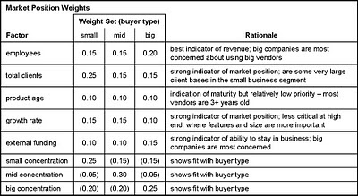
As with product fit, I used different weights for different types of buyers. As you'll see below, the bulk of the weight was assigned to concentration within each market. This reflects the fact that buyers really do want vendors who have experience with similar companies. Specific rationales are in the table. I converted the entries to the standard 0-2 scale and originally required the weights to add to 100. This changed when I added negative scoring to sharpen distinctions among vendor groups.


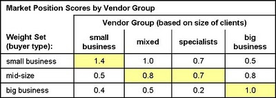
These weights produced a reasonable set of vendor group scores – small vendors scored best for small buyers, mixed and special vendors scored best for mid-size buyers, and big vendors scored best for big buyers. QED.


I should stress that all the score development I've described in these posts was done by looking at the vendor groups, not at individual vendors. (Well, maybe I peeked a little.) The acid test is when the individual vendors scores are plotted -- are different kinds of vendors pretty much where expected, without each category being so tightly clustered together that there's no meaningful differentiation?

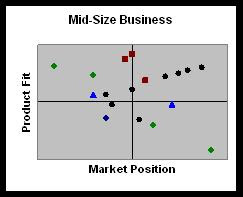
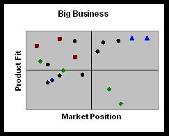
The charts below show the results, without revealing specific vendor names. Instead, I've color-coded the points (each representing one vendor) using the same categories as before: green for small business vendors, black for mixed vendors, violet for specialists, and blue for big company vendors.


As you can see, the blue and green dots do dominate the upper right quadrants of their respective charts. The other colors are distributed in intriguing positions that will be very interesting indeed once names are attached. This should happen in early to mid January, once I finish packaging the data into a proper report. Stay tuned, and in the meantime have a Happy New Year.

Tuesday, December 28, 2010

Ranking B2B Marketing Automation Vendors: Part 2

Summary: Yesterday's post described the objectives of my product fit scores for B2B marketing automation vendors and how I set up the original weighting for individual elements. But the original set of scores seemed to favor more complex products, even for small business marketers. Here's how I addressed the problem.

Having decided that my weights needed adjusting, I wanted an independent assessment of which features were most appropriate for each type of buyer. I decided I could base this on the features each set of vendors provided. The only necessary assumption is that vendors offer the features that their target buyers need most. That seems like a reasonable premise -- or at least, more reliable than just applying my own opinions.

For this analysis, I first calculated the average score for each feature in each vendor group. Remember that I was working with a matrix of 150+ features for each vendor, each scored from 0 to 2 (0=not provided, 1=partly provided, 2=fully provided). A higher average means that more vendors provide the feature.

I then sorted the feature list based on average scores for the small business vendors. This put the least common small business features at the top and the most common at the bottom. I divided the list into six roughly-equal sized segments, representing feature groups that ranged from rare to very common. The final two segments both contained features shared by all small business vendors. One segment had features that were also shared by all big business vendors; the other had features that big business vendors didn't share. Finally, I calculated an average score for the big business vendors for each of the six groups.

What I found, not surprisingly, was that some features are more common in big-company systems, some are in all types of systems, and a few are concentrated among small-company systems. In each group, the intermediate vendors (mixed and special) had scores between the small and large vendor scores. This is additional confirmation that the groupings reflect a realistic ranking by buyer needs (or, at least, the vendors’ collective judgment of those needs).


The next step was to see whether my judgment matched the vendors’. Using the same feature groups, I calculated the aggregate weights I had already assigned to the those features for each buyer type. Sure enough, the big business features had the highest weights in the big business set, and the small business weights got relatively larger as you moved towards the small business features. The mid-size weights were somewhere in between, exactly where they should have been. Hooray for me!


Self-congratulation aside, we now have firmer ground for adjusting the weights to distinguish systems for different types of buyers. Remember, the small business scores in particular weren’t very different for the different vendor groups, and actually gave higher scores to big business vendors once you removed the adjustment for price. (As you may have guessed, most features in the “more small” group are price-related – proving, as if proof were necessary, that small businesses are very price sensitive.)

From here, the technical solution here is quite obvious: assign negative weights to big business features in the small business weight set. This recognizes that unnecessary features actually reduce the value of a system by making it harder to use. The caveat is that different users need different features. But that's why we have different weight sets in the first place.

(As an aside, it’s worth exploring why only assigning lower weights to the unnecessary features won’t suffice. Start with the fact that even a low weight increases rather than reduces a product score, so products with more features will always have a higher total. This is a fundamental problem with many feature-based scoring systems. In theory, assigning higher weights to other, more relevant factors might overcome this, but only if those features are more common among the simpler systems. In practice, most of the reassigned points will go to basic features which are present in all systems. This means the advanced systems get points for all the simple features plus the advanced features, while simple systems get points for the simple features only. So the advanced systems still win. That's just what happened with my original scores.)

Fortified with this evidence, I revisited my small business scoring and applied negative weights to items I felt were important only to large businesses. I applied similar but less severe adjustments to the mid-size weight set. The mid-size weights were in some ways a harder set of choices, since some big-company features do add value for mid-size firms. Although I worked without looking at the feature groups, the negative scores were indeed concentrated among the features in the large business groups:


I used the adjusted weights to create new product fit scores. These now show much more reasonable relationships across the vendor groups: that is, each vendor group has the highest scores for its primary buyer type and there’s a big difference between small and big business vendors. Hooray for me, again.


One caveat is that negative scores mean that weights in each set no longer add to 100%. This means that scores from different weight sets (i.e., reading down the chart) are no longer directly comparable. There are technical ways to solve this, but it's not worth the trouble for this particular project.

Tomorrow I'll describe the vendor fit scores. Mercifully, they are much simpler.

Monday, December 27, 2010

Ranking B2B Marketing Automation Vendors: How I Built My Scores (part 1)

Summary: The first of three posts describing my new scoring system for B2B marketing automation vendors.

I’ve finally had time to work up the vendor scores based on the 150+ RFP questions I distributed back in September. The result will be one of those industry landscape charts that analysts seem pretty much obliged to produce. I have never liked those charts because so many buyers consider only the handful of anointed “leaders”, even though one of the less popular vendors might actually be a better fit. This happens no matter how loudly analysts warn buyers not to make that mistake.

On the other hand, such charts are immensely popular. Recognizing that buyers will use the chart to select products no matter what I tell them, I settled on dimensions that are directly related to the purchase process:

- product fit, which assesses how well a product matches buyer needs. This is a combination of features, usability, technology, and price.

- vendor strength, which assesses a vendor’s current and future business position. This is a combination of company size, client base, and financial resources.

These are conceptually quite different from the dimensions used in the Gartner and Forrester reports* , which are designed to illustrate competitive position. But I’m perfectly aware that only readers of this blog will recognize the distinction. So I've also decided to create three versions of the chart, each tailored to the needs of different types of buyers.

In the interest of simplicity, my three charts will address marketers at small, medium and big companies. The labels are really short-hand for the relative sophistication and complexity of user requirements. But if I explicitly used a scale from simple to sophisticated, no one would ever admit that their needs were simple -- even to themselves. I've hoping the relatively neutral labels will encourage people to be more realistic. In practice, we all know that some small companies are very sophisticated marketers and some big companies are not. I can only hope that buyers will judge for themselves which category is most appropriate.

The trick to producing three different rankings from the same set of data is to produce three sets of weights for the different elements. Raab Associates’ primary business for the past two decades has been selecting systems, so we have a well-defined methodology for vendor scoring.

Our approach is to first set the weights for major categories and then allocate weights within those categories. The key is that the weights must add to 100%. This forces trade-offs first among the major categories and then among factors within each category. Without the 100% limit, two things happen:

- everything is listed as high priority. We consistently found that if you ask people to rate features as "must have" "desirable" and "not needed", 95% of requirements are rated as “must have”. From a prioritization standpoint, that's effectively useless.

- categories with many factors are overweighted. What happens is that each factor gets at least one point, giving the category a high aggregate total. For example, category with five factors has a weight of at least five, while a category with 20 factors has a weight of 20 or more.

The following table shows the major weights I assigned. The heaviest weight goes to lead generation and nurturing campaigns – a combined 40% across all buyer types. I weighted pricing much more heavily for small firms, and gabe technology, lead scoring and technology heavier weights at larger firms. You’ll notice that Vendor is weighted at zero in all cases: remember that these are weights for product fitness scores. Vendor strength will be scored on a separate dimension.


I think these weights are reasonable representations of how buyers think in the different categories. But they’re ultimately just my opinion. So I also created a reality check by looking at vendors who target the different buyer types.

This was possible because the matrix asked vendors to describe their percentage of clients in small, medium and large businesses. (The ranges were under $20 million, $20 million to $500 million, and over $500 million annual revenue.) Grouping vendors with similar percentages of small clients yielded the following sets:

- small business (60% or more small business clients): Infusionsoft, OfficeAutoPilot, TrueInfluence

- mixed (33-66% small business clients): Pardot, Marketo, Eloqua, Manticore Technology, Silverpop, Genius

- specialists (15%-33% small business): LeadFormix, TreeHouse Interactive, SalesFUSION

- big clients (fewer than 15% small business): Marketbright, Neolane, Aprimo On Demand

(I also have data from LoopFuse, Net Results, and HubSpot, but didn’t have the client distribution for the first two. I excluded HubSpot because it is a fundamentally different product.)

If my weights were reasonable, two things should happen:

- vendors specializing in each client type should have the highest scores for that client type (that is, small business vendors have higher scores than big business vendors using the small business weights.)

- vendors should have their highest scores for their primary client type (that is, small business vendors should have higher scores with small business weights than with big business weights).

As the table below shows, that is pretty much what happened:


So far so good. But how did I know I’d assigned the right weights to the right features?

I was particularly worried about the small business weights. These showed a relatively small difference in scores across the different vendor groups. In addition, I knew I had weighted price heavily. In fact, it turned out that if I took price out of consideration, the other vendor groups would actually have higher scores than the small business specialists. This couldn't be right: the other systems are really too complicated for small business users, regardless of price.


Clearly some adjustments were necessary. I'll describe how I handled this in tomorrow's post.

_______________________________________________________
* “ability to execute” and “completeness of vision” for Gartner, “current offering”, “market presence” and “strategy” for Forrester.

Wednesday, December 22, 2010

Teradata Buys Aprimo for $525 Million: More Marketing Automation Consolidation To Come

Summary: Teradata's acquisition of Aprimo takes the largest remaining independent marketing automation vendor off the market. The market will probably split between enterprise-wide suites and more limited marketing automation systems.

Teradata announced today that is acquiring marketing automation vendor Aprimo for a very hefty $525 million – even more than the $480 million that IBM paid for somewhat larger Unica in August.

Given the previous Unica deal. other recent marketing system acquisitions, and wide knowledge that Aprimo was eager to sell, no one is particularly surprised by this transaction. Teradata is a logical buyer, having a complementary campaign management system but lacking Aprimo’s marketing resource management, cloud-based technology and strong B2B client base (although Aprimo has stressed to me more than once that 60% of their revenue is from B2C clients).

This is obviously a huge decision for Teradata, a $1.7 billion company compared with IBM’s $100 billion in revenue. It stakes a claim to a piece of the emerging market for enterprise-wide marketing systems, the same turf targeted in recent deals by IBM, Oracle, Adobe and Infor (and SAS and SAP although they haven’t made major acquisitions).

This enterprise market is probably going to evolve into something distinct from traditional “marketing automation”. The difference: marketing automation is focused on batch and interactive campaign management but just touches slightly on advertising, marketing resource management and analytics. The enterprise market involves unified systems sold at the CEO, CFO, CIO and CMO levels, whereas marketing automation has been sold largely to email and Web marketers within marketing departments.

The existence of C-level buyers for marketing systems is not yet proven, and I remain a bit of a skeptic. But many smart people are betting a lot of money that it will appear, and will spend more money to make it happen. Aprimo is probably the vendor best positioned to benefit because its MRM systems inherently work across an entire marketing department (although I’m sure many Aprimo deployments are more limited). So, in that sense at least, Teradata has positioned itself particularly well to take advantage of the new trend. And if IBM and Oracle want to invest in developing that market so that Teradata can benefit, so much the better for Teradata.

That said, there's still some question whether Teradata can really benefit if this market takes off. Aprimo adds a great deal of capability, but the combined company still lacks the strong Web analytics and BI applications of its main competitors. A closer alliance with SAS might fill that gap nicely...and acquisition or merger between the two firms is perfectly conceivable, at least superficially. Lack of professional services is perhaps less an issue since it makes Teradata a more attractive partner to the large consulting firms (Accenture, CapGemini, etc.) who already use its tools and must be increasingly nervous about competition from IBM’s services group.

The other group closely watching these deals are the remaining marketing automation vendors themselves. Many would no doubt be delighted to sell at such prices. But, as Eloqua’s Joe Payne points out in his own comment on the Aprimo deal, the remaining vendors are all much smaller: while Unica and Aprimo each had around $100 million revenue, Eloqua and Alterian are around $50 million, Neolane and SmartFocus are $20-$30 million, and Marketo said recently it expects nearly $15 million in 2010. I doubt any of the others reach $10 million. (This excludes email companies like ExactTarget, Responsys and Silverpop [which does have a marketing automation component].) Moreoever, the existing firms skew heavily to B2B clients and smaller companies, which are not the primary clients targeted by big enterprise systems vendors.

That said, I do expect continued acquisitions within this space. I’d be surprised to see the 4-5x revenue price levels of the Unica and Aprimo deals, but even lower valuations would be attractive to owners and investors facing increasingly cut-throat competition. As I’ve written many times before, the long-term trend will be for larger CRM and Web marketing suites to incorporate marketing automation functions, making stand-alone marketing automation less competitive. Survivors will offer features for particular industries or specialized functions that justify purchase outside of the corporate standard. And the real money will be made by service vendors who can help marketers fully benefit from these systems.

Sunday, December 12, 2010

Predictions for B2B Marketing in 2011

I don't usually bother with the traditional "predictions for next year" piece at this time of year. But I happened to write one in response to a question at the Focus online community last week. So I figured I'd share it here as well.

Summary: 2011 will see continued adjustment as B2B lead generators experiment with the opportunities provided by new media.

1. Marketing automation hits an inflection point, or maybe two. Mainstream B2B marketers will purchase marketing automation systems in large numbers, having finally heard about it often enough to believe it's worthwhile. But many buyers will be following the herd without understanding why, and as a result will not invest in the training, program development and process change necessary for success. This will eventually lead to a backlash against marketing automation, although that might not happen until after 2011.

2. Training and support will be critical success factors. Whether or not they use marketing automation systems, marketers will increasingly rely on external training, consultants and agencies to help them take advantage of the new possibilities opened by changes in media and buying patterns. Companies that aggressively seek help in improving their skills will succeed; those who try to learn everything for themselves by trial-and-error will increasingly fall behind the industry. Marketing automation vendors will move beyond current efforts at generic industry education to provide one-on-one assistance to their clients via their own staff, partners, and built-in system features that automatically review client work, recommend changes and sometimes implement them automatically. (Current examples: Hubspot's Web site grader for SEO, Omniture Test & Target for landing page optimization, Google AdWords for keyword and copy testing.)

3. Integration will be the new mantra. Marketers will struggle to incorporate an ever-expanding array of online marketing options: not just Web sites and email, but social, mobile, location-based, game-based, app-based, video-based, and perhaps even base-based. Growing complexity will lead them to seek integrated solutions that provide a unified dashboard to view and manage all these media. Vendors will scramble to fill this need. Competitors will include existing marketing automation and CRM systems seeking to use their existing functions as a base, and entirely new systems that provide a consistent interface to access many different products transparently via their APIs.

4. SMB systems will lead the way. Systems built for small businesses will set the standard for ease of use, integration, automation and feedback. Lessons learned from these systems will be applied by their developers and observant competitors to help marketers at larger companies as well. But enterprise marketers have additional needs related to scalability, content sharing and user rights management, which SMB systems are not designed to address. Selling to enterprises is also very different from selling to SMBs. So the SMB vendors themselves won't necessarily succeed at moving upwards to larger clients.

5. Social marketing inches forward. Did you really think I'd talk about trends without mentioning social media? Marketers in 2011 will still be confused about how to make best use of the many opportunities presented by social media. Better tools will emerge to simplify and integrate social monitoring, response and value measurement. Like most new channels, social will at first be treated as a separate specialty. But advanced firms will increasingly see it as one of many channels to be managed, measured and eventually integrated with the rest of their marketing programs. Social extensions to traditional marketing automation systems will make this easier.

6. The content explosion implodes: marketers will rein in runaway content generation by adopting a more systematic approach to understanding the types of content needed for different customer personas at different stages in the buying cycle. Content management and delivery systems will be mapped against these persona/stage models to simplify delivery of the right content in the right situation. Marketers will develop small, reusable content "bites" that can be assembled into custom messages, thereby both reducing the need for new content and enabling more appropriate customer treatments. Marketers will also be increasingly insistent on measuring the impact of their messages, so they can use the results to improve the quality of their messages and targeting. Since this measurement will draw on data from multiple systems, including sales and Web behaviors, it will occur in measurement systems that are outside the delivery systems themselves.

7. Last call for last click attribution: marketers will seriously address the need to show the relationship between their efforts and revenue. This will force them to abandon last-click attribution in favor of methods that address the impact of all treatments delivered to each lead. Different vendors and analysts will propose different techniques to do this, but no single standard will emerge before the end of 2011.

Wednesday, December 08, 2010

Case Study: Using a Scenario to Select Business Intelligence Software

Summary: Testing products against a scenario is critical to making a sound selection. But the scenario has to reflect your own requirements. While this post shows results from one test, rankings could be very different for someone else.

I’m forever telling people that the only reliable way to select software is to devise scenarios and test the candidate products against them. I recently went through that process for a client and thought I’d share the results.

1. Define Requirements. In this particular case, the requirements were quite clear: the client had a number of workers who needed a data visualization tool to improve their presentations. These were smart but not particularly technical people and they only did a couple of presentations each month. This mean the tool had to be extremely easy to use, because the workers wouldn’t find time for extensive training and, being just occasional users, would quickly forget most of they had learned. They also wanted to do some light ad hoc analysis within the tool, but just on small, summary data sets since the serious analytics are done by other users earlier in the process. And, oh, by the way, if the same tool could provide live, updatable dashboards for clients to access directly, that would be nice too. (In a classic case of scope creep, the client later added mapping capabilities to the list, merging this with a project that had been running separately.)

During our initial discussions, I also mentioned that Crystal Xcelsius (now SAP Crystal Dashboard Design) has the very neat ability to embed live charts within Powerpoint documents. This became a requirement too. (Unfortunately, I couldn’t find a way to embed one of those images directly within this post, but you can click here to see a sample embedded in a pdf. Click on the radio buttons to see the different variables. How fun is that?)

2. Identify Options. Based on my own knowledge and a little background research, I built a list of candidate systems. Again, the main criteria were visualization, ease of use and – it nearly goes without saying – low cost. A few were eliminated immediately due to complexity or other reasons. This left:

3. Define the Scenario. I defined a typical analysis for the client: a bar chart comparing index values for four variables across seven customer segments. The simplest bar chart showed all segment values for one variable. Another shows all variables for all segments, sorted first by variable and then by segment, with the segments ranked according to response rate (one of the five variables). This would show how the different variables related to response rate. It looked like this:


The tasks to execute the scenario were:


  • connect to a simple Excel spreadsheet (seven segments x four variables.)*

  • create a bar chart showing data for all segments for a single variable.

  • create a bar chart showing data for all segments for all variables, clustered by variable and sorted by the value of one variable (response index).

  • provide users with an option to select or highlight individual variables and segments.
Because my requirements assumed users would have little or no training, I specified that the scenarios be performed without taking time to learn each system. This made the testing easy, but I should stress it's an unusual situation: in most cases, systems are run by people who use them often enough to become experts. For situations like that, you should have an experienced user (often a vendor sales rep or engineer) execute the scenario for you. In fact, one of the most common errors we see is people judging a system by how easily they can run it without training – something that favors systems which are easy to use for simple tasks, but lack the functional depth clients will eventually need to do their real jobs.

4. Results. I was able to download free or trial versions of each system. I installed these and then timed how long it took to complete the scenario, or at least to get as far as I could before reaching the frustration level where a typical end-user would stop.

I did my best to approach each system as if I’d never seen it before, although in fact, I’ve done at least some testing on every product except SpotFire, and have worked extensively with Xcelsius and QlikView. As a bit of a double-check, I dragooned one of my kids into testing one system when he was innocently visiting home over Thanksgiving: his time was actually quicker than mine. I took that as a proof I'd tested fairly.

Notes from the tests are below.


  • Xcelsius (SAP Crystal Dashboard Design): 3 hours to set up bar chart with one variable and allowing selection of individual variables. Did not attempt to create chart showing multiple variables. (Note: most of the time was spent figuring out how Xcelsius did the variable selection, which is highly unintuitive. I finally had to cheat and use the help functions, and even then it took at least another half hour. Remember that Xcelsius is a system I’d used extensively in the past, so I already had some idea of what I was looking for. On the other hand, I reproduced that chart in just a few minutes when I was creating the pdf for this post. Xcelsius would work very well for a frequent user, but it’s not for people who use it only occasionally.)


  • Advizor: 3/4 hour to set up bar chart. Able to show multiple variables on same chart but not to group or sort by variable. Not obvious how to make changes (must click on a pull down menu to expose row of icons).


  • Spotfire: 1/2 hour to set up bar chart. Needed to read Help to put multiple lines or bars on same chart. Could not find way to sort or group by variable.


  • QlikView: 1/4 hour to set up bar chart (using default wizard). Able to add multiple variables and sort segments by response index, but could not cluster by variable or expose menu to add/remove variables. Not obvious how to make changes (must right-click to open properties box – I wouldn’t have known this without my prior QlikView experience).


  • Lyzasoft: 1/4 hour to set up bar chart with multiple variables. Able to select individual variables, cluster by variable and sort by response index, but couldn’t easily assign different colors to different variables (required for legibility). Annoying lag each time chart is redrawn.


  • Tableau: 1/4 hour to set up bar chart with multiple variables. Able to select individual variables, cluster by variable, and sort by variable. Only system to complete the full scenario.
Let me stress again that these results apply only to this particular scenario. Specifically, the ability to cluster the bars by segments within variables turned out to be critical in this test but doesn't come up very often in the real world. Other requirements, such as advanced collaboration, sophisticated dashboards or specialized types of graphics, would have yielded very different ranks.

5. Final Assessment. Although the scenario nicely addressed ease of use, there were other considerations that played into the final decision. These required a bit more research and some trade-offs, particularly regarding the Xcelsius-style ability to embed interactive charts within a Powerpoint slide. No one else on the list could do this without either loading additional software (often a problem when end-user PCs are locked down by corporate IT) or accessing an external server (a problem for mobile users and with license costs).

The following table shows my results:


6. Next Steps. The result of this project wasn’t a final selection, but a recommendation of a couple of products to explore in depth. There were still plenty of details to research and confirm. However, starting with a scenario greatly sped up the work, narrowed the field, and ensured that the final choice would meet operational requirements. That was well worth the effort. I strongly suggest you do the same.


____________________________________

* The actual data looked like this. Here's a link if you want to download it:

Tuesday, December 07, 2010

Tableau Software Adds In-Memory Database Engine

Summary: Tableau has added a large-scale in-memory database engine to its data analysis and visualization software. This makes it a lot more powerful.

Hard to believe, but it's more than three years since my review of Tableau Software’s data analysis system. Tableau has managed quite well without my attention: sales have doubled every year and should exceed $40 million in 2010; they have 5,500 clients, 60,000 users and 185 employees; and they plan to add 100 more employees next year. Ah, I knew them when.

What really matters from a user perspective is that the product itself has matured. Back in 2007, my main complaint was that Tableau lacked a data engine. The system either issued SQL queries against an external database or imported a small data set into memory. This meant response time depended on the speed of the external system and that users were constrained by the external files' data structure.

Tableau’s most recent release (6.0, launched on November 10) finally changes this by adding a built-in data engine. Note that I said “changes” rather than “fixes”, since Tableau has obviously been successful without this feature. Instead, the vendor has built connectors for high-speed analytical databases and appliances including Hyperion Essbase, Greenplum, Netezza, PostgreSQL, Microsoft PowerPivot, ParAccel, Sybase IQ, Teradata, and Vertica. These provide good performance on any size database, but they still leave the Tableau user tethered to an external system. An internal database allows much more independence and offers high performance when no external analytical engine is present. This is a big advantage since such engines are still relatively rare and, even if a company has one, it might not contain all the right data or be accessible to Tableau users.

Of course, this assumes that Tableau's internal database is itself a high-speed analytical engine. That’s apparently the case: the engine is home-grown but it passes the buzzword test (in-memory, columnar, compressed) and – at least in an online demo – offered near-immediate response to queries against a 7 million row file. It also supports multi-table data structures and in-memory “blending” of disparate data sources, further freeing users from the constraints of their corporate environment. The system is also designed to work with data sets that are too large to fit into memory: it will use as much memory as possible and then access the remaining data from disk storage.

Tableau has added some nice end-user enhancements too. These include:

- new types of combination charts;
- ability to display the same data at different aggregation levels on the same chart (e.g., average as a line and individual observations as points);
- more powerful calculations including multi-pass formulas that can calculate against a calculated value
- user-entered parameters to allow what-if calculations

The Tableau interface hasn’t changed much since 2007. But that's okay since I liked it then and still like it now. In fact, it won a little test we conducted recently to see how far totally untrained users could get with a moderately complex task. (I'll give more details in a future post.)

Tableau can run either as traditional software installed on the user's PC or on a server accessed over the Internet. Pricing for a single user desktop system is still $999 for a version that can connect to Excel, Access or text files, and has risen slightly to $1,999 for one that can connect to other databases. These are perpetual license fees; annual maintenance is 20%.

There’s also a free reader that lets unlimited users download and read workbooks created in the desktop system. The server version allows multiple users to access workbooks on a central server. Pricing for this starts at $10,000 for ten users and you still need at least one desktop license to create the workbooks. Large server installations can avoid per-user fees by purchasing CPU-based licenses, which are priced north of $100,000.

Although the server configuration makes Tableau a candidate for some enterprise reporting tasks, it can't easily limit different users to different data, which is a typical reporting requirement. So Tableau is still primarily a self-service tool for business and data analysts. The new database, calculation and data blending features add considerably to their power.

Monday, December 06, 2010

QlikView's New Release Focuses on Enterprise Deployment

I haven’t written much about QlikView recently, partly because my own work hasn’t required using it and partly because it’s now well enough known that other people cover it in depth. But it remains my personal go-to tool for data analysis and I do keep an eye on it. The company released QlikView 10 in October and Senior Director of Product Marketing Erica Driver briefed me on it in a couple of weeks ago. Here’s what’s up.

- Business is good. If you follow the industry at all, you already know that QlikView had a successful initial public stock offering in July. Driver said the purpose was less to raise money than to gain the credibility that comes from being a public company. (The share price has nearly doubled since launch, incidentally.) The company has continued its rapid growth, exceeding 15,000 clients and showing 40% higher revenue vs. the prior year in its most recent quarter. Total revenues will easily exceed $200 million for 2010. Most clients are still mid-sized businesses, which is QlikView’s traditional stronghold. But more big enterprises are signing on as well.

- Features are stable. Driver walked me through the major changes in QlikView 10. From an end-user perspective, none were especially exciting -- which simply confirms that QlikView already had pretty much all the features it needed.

Even the most intriguing user-facing improvements are pretty subtle. For example, there’s now an “associative search” feature that means I can enter client names in a sales rep selection box and the system will find the reps who serve those clients. Very clever and quite useful if you think about it, but I’m guessing you didn’t fall off you chair when you heard the news.

The other big enhancement was a “mekko” chart, which is bar chart where the width of the bar reflects a data dimension. So, you could have a bar chart where the height represents revenue and the width represents profitability. Again, kinda neat but not earth-shattering.

Let me stress again that I’m not complaining: QlikView didn’t need a lot of new end-user features because the existing set was already terrific.

- Development is focused on integration and enterprise support. With features under control, developers have been spending their time on improving performance, integration and scalability. This involves geeky things aimed at like a documented data format for faster loads, simpler embedding of QlikView as an app within external Web sites, faster repainting of pages in the AJAX client, more multithreading, centralized user management and section access controls, better audit logging, and prebuilt connectors for products including SAP and Salesforce.com.

There’s also a new API that lets external objects to display data from QlikView charts. That means a developer can, say, put QlikView data in a Gantt chart even though QlikView itself doesn’t support Gantt charts. The company has also made it easier to merge QlikView with other systems like Google Maps and SharePoint.

These open up some great opportunities for QlikView deployments, but they depend on sophisticated developers to take advantage of them. In other words, they are not capabilities that a business analyst -- even a power user who's mastered QlikView scripts -- will be able to handle. They mark the extension of QlikView from stand-alone dashboards to a system that is managed by an IT department and integrated with the rest of the corporate infrastructure.

This is exactly the "pervasive business intelligence" that industry gurus currently tout as the future of BI. QlikView has correctly figured out that it must move in this direction to continue growing, and in particular to compete against traditional BI vendors at large enterprises. That said, I think QlikView still has plenty of room to grow within the traditional business intelligence market as well.

- Mobile interface. This actually came out in April and it’s just not that important in the grand scheme of things. But if you’re as superficial as I am, you’ll think it’s the most exciting news of all. Yes, you can access QlikView reports on iPad, Android and Blackberry smartphones, including those touchscreen features you’ve wanted since seeing Minority Report. The iPad version will even use the embedded GPS to automatically select localized information. How cool is that?

Thursday, December 02, 2010

HubSpot Expands Its Services But Stays Focused on Small Business

Summary: HubSpot has continued to grow its customer base and expand its product. It's looking more like a conventional small-business marketing automation system every day.

You have to admire a company that defines a clear strategy and methodically executes it. HubSpot has always aimed to provide small businesses with one easy-to-use system for all their marketing needs. The company began with search engine optimization to attract traffic, and added landing pages, blogging, Web hosting, lead scoring, and Salesforce.com integration. Since my July 2009 review, HubSpot has further extended the system to include social media monitoring and sharing, limited list segmentation and simple drip marketing campaigns. It is now working on more robust outbound email, support for mobile Web pages, and APIs for outside developers to create add-on applications.

The extension into email is a particularly significant step for HubSpot, placing it in more direct competition with other small business marketing systems like Infusionsoft, OfficeAutoPilot and Genoo. Of course, this competition was always implicit – few small businesses would have purchased HubSpot plus one of those products. But HubSpot’s “inbound marketing” message was different enough that most buyers would have decided based on their marketing priorities (Web site or email?). As both sets of systems expand their scope, their features will overlap more and marketers will compare them directly.

Choices will be based on individual features and supporting services. In terms of features, HubSpot still offers unmatched search engine optimization and only Genoo shares its ability to host a complete Web site (as opposed to just landing pages and microsites). On the other hand, HubSpot’s lead scoring, email and nurture campaigns are quite limited compared with its competitors. Web analytics, social media and CRM integration seem roughly equivalent.

One distinct disadvantage is that most small business marketing automation systems offer their own low-cost alternative to Salesforce.com, while HubSpot does not. HubSpot’s Kirsten Knipp told me the company has no plans to add this, relying instead on easy integration with systems like SugarCRM and Zoho. But I wouldn’t be surprised if they changed their minds.

In general, though, HubSpot’s growth strategy seems to rely more on expanding services than features. This makes sense: like everyone else, they've recognized that most small businesses (and many not-so-small businesses) don’t know how to make good use of a marketing automation program. This makes support essential for both selling and retaining them as customers.

One aspect of service is consulting support. HubSpot offers three pricing tiers that add service as well as features at the levels increase. The highest tier, still a relatively modest $18,000 per year, includes a weekly telephone consultation.

The company has also set up new programs to help recruit and train marketing experts who can resell the product and/or use it to support their own clients. These programs include sales training, product training, and certification. They should both expand HubSpot’s sales and provide experts to help buyers that HubSpot sells directly.

So far, HubSpot’s strategy has been working quite nicely. The company has been growing at a steady pace, reaching 3,500 customers in October with 98% monthly retention. A couple hundred of these are at the highest pricing tier, with the others split about evenly between the $3,000 and $9,000 levels. This is still fewer clients than Infusionsoft, which had more than 6,000 clients as of late September. But it's probably more than any other marketing automation vendor and impressive by any standard.