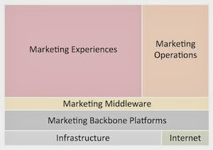
I’m delighted that Scott has found the CDP concept useful† and am in turn happy to adopt his distinction between Backbone Platforms and the other types of marketing applications. The Backbone Platforms are, indeed, platforms that support most Experience and Operations systems, enabling those systems to focus on particular tasks without creating complete customer management environments of their own. That's a difference worth noting.
Scott never claimed that his diagram illustrates a precise relationship among the components, so it's no criticism to point out that it doesn't. Experience and Operations systems sometimes connect with Backbone Platforms through a Middleware system, but more often they connect with the Backbone Platforms directly. In fact, some of the Experience and Operations systems connect with multiple Platforms, serving as sort of do-it-yourself Middleware. The challenge of illustrating this becomes clear when you try adding lines to show how the classes of systems interact with each other – it’s not as simple as connecting the adjacent layers on Scott’s diagram.
Being a visual thinker, I found this ambiguity to be endlessly disturbing.** Try as I might, I couldn’t rearrange the boxes to show the relationships correctly.
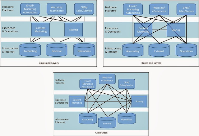
Then, I had a dream about a snake rolling downhill with its tail in its mouth, and discovered the answer: the systems could all be arranged in a circle graph, allowing any two to be connected directly.††
I must admit that I am ridiculously pleased with this approach. I know there’s nothing especially brilliant about circle graphs per se, but I’ve never seen one used in an architecture diagram. The pictures below illustrate, at least to my satisfaction, how much more clearly the circle graph shows relationships among systems than the traditional boxes and layers. Each diagram shows the same relationships among a small set of systems. The top left picture uses the traditional approach of showing only the links between categories – as you see, this hides any connections between non-adjacent components or individual systems. The top right picture shows the direct connections between systems, but it’s hard to read because lines cross behind the boxes. True, you could use curved lines to avoid this, but that quickly becomes impractical. The bottom picture shows the circle approach: here, the lines themselves might cross but no connections are hidden. The relative clarity of the circle graph grows as more systems are introduced.
Showing the actual connections between system pairs has another advantage: it lets you represent the architecture as a formal graph, meaning you can compare architectures using standard graph analysis techniques. Even just counting the connections gives a useful measure of relative complexity.
The diagrams below illustrate this nicely: the top picture shows the same architecture as before, which has 14 system-to-system connections (out of 28 possible pairs, another useful metric, even though some wouldn't make much sense). The bottom picture shows the same systems with everything connecting through a central database: now there are only eight connections and several missing system-to-system links have been provided automatically. If you want a crude approximation of how much a central database reduces complexity (and hence cost), this is good place to start.
The circle approach has other advantages, such as making it easier to see missing connections between systems. I'm working on it as part of a larger methodology to help marketers assess the value of a Customer Data Platform and plan for deployment. I expect to be describing the full approach over the next couple of months...stay tuned for details.
______________________________________________________________________________________
*a name that virtually demands a sidekick. Obvious choice is “Data Boy” but I’m sure my readers can think of something more clever.
† and appreciate the credit has he given me.
** Yes, I do recognize how fortunate I am that this is of my major problems in life.
†† Not really. The snake dream is how Kekulé discovered the structure of benzene. But it makes a good story, eh?


1 comment:
Hi, David -- I love this visualization of the way the different components in the "marketing stack" are actually interrelated.
So many people use the phrase "stack" to describe their collection of marketing technologies. But it's definitely a misnomer. As much as when I say I have a "stack of work" on my desk, which looks much more like a tornado disaster area.
Post a Comment