Showing posts with label user interface. Show all posts

Thursday, December 15, 2011

Marketing Automation Interface Should Focus on Customers, Not Campaigns


Several vendors have shown me their new campaign management interfaces recently. All were refined, attractive, and thoughtful. Each had subtle features that appeal to a connoisseur: floating tool pallets! Fly-over icon labels! Dynamic menus! Curved lines!  But they’re all still basically the same flow charts that Frank Gilbreth (of Cheaper by the Dozen fame) introduced in 1921 and we've seen in marketing systems for more than 20 years.


Now, I’m not saying marketing automation vendors should find a new approach just because I’m bored with the old one. But the truth is that the old way doesn’t work: every experienced developer I’ve ever spoken with has told me they’ve found users get confused when flow charts grow past a handful of branches. That’s true even though users themselves design campaigns by drawing a flow chart on a whiteboard. If you watch that process closely, you’ll see that (a) users themselves have trouble when their diagram gets too complex and (b) they can’t make much sense of it when they come back the next morning (assuming the whiteboard wasn’t erased).

Developers have taken two approaches to this challenge. One is to add features that help manage complexity – all those floating pallets and pop-up menus. These do help but it’s like Chaos Theory as explained in Jurassic Park: piling complexity on complexity eventually ends in a catastrophic collapse. The other approach is to simplify the experience by removing capabilities such as multiple branches and recursive loops. The extreme version of this is interfaces that define each campaign as a single sequence of steps, with no branching at all. This is certainly comprehensible but it can prevent marketers from doing what they want.

Something more radical is needed. Developers must think outside the flow chart. One way to start is to consider interfaces they’re already using in other systems.
  • touch screen. Dragging and poking at a flow chart with your fingers instead of a mouse wouldn’t be much of an improvement, although it would help. Creating splits by stretching an icon until it breaks into pieces might be kinda fun. Scaling up or down the way you zoom into online maps – and having the level of detail adjust automatically – would definitely be an improvement. But I’m guessing there are some more dramatic alternatives that avoid the flow chart altogether.  Think about your favorite touch screen apps and see what comes to mind. How could you design a marketing campaign with Angry Birds?
  • voice activation. I have no interest in speaking the same commands I could type. But a system that understands voice commands has natural language capabilities to infer what I need based on context and past experience, and thus save me the work of defining the details explicitly. (Think IBM Watson on Jeopardy or iPhone Siri.) If you think about the primal whiteboard scenario, what really happens is the marketers say “let’s add a split here” before drawing it – so a natural language approach could be a big time saver by skipping the drawing step altogether. Or the system might actually ask questions and make suggestions that lead the marketer through the design process: Who is your target market? How many reminder emails do you want? Might I suggest you add a reward: here are the best three to consider.
  • virtual reality. The biggest problem with flow charts is they are inherently two dimensional.  This means that intersecting branches must visually overlap, which is very confusing.  Could a virtual reality interface let marketers follow each path independently, like walking down a street or flying through a forest? This comes closer to simulating the customer’s experience – perhaps the marketer could be pelted with messages as she passes through (I’m thinking of monkeys throwing fruit), and toss them back as a response.  Or, imagine a road map that traces the customer's physical journey through  both the real world and cyberspace, with marketing messages presented as billboards and interactions as conversations with passersby.  Or could you map the customer journey itself – a trip through the funnel – with a similar presentation of billboards and conversations?  Think of a child's board game like Candyland or, perhaps more appropriate, Alice's trip down the rabbit hole. 
  • data visualization. Think of all those cool illustrations you’ve seen of social networks, molecular structures, Web behaviors, economic trends, geospatial data, manufacturing processes, and who knows what. Why can't marketing systems do better than flow charts and pie graphs? How about a three-dimensional campaign diagram that you can rotate and zoom on three axes? Or a six-dimensional view using height, width, depth, color, size, and shape, with a slider for time? Some of these might be hard to interpret but even a flow chart takes some training to understand. I'm certain that creative design can pack more information into a simpler package.
  • games and simulation. Could a marketing campaign sprout like a tree, growing more complex over time and bearing customers as fruit? Simulation games use simple rules and a few user choices to create elaborate cities, empires, and organisms. Some already let users run model businesses. More advanced versions of those programs could use rules derived from your customers' actual behavior to test alternative campaign designs and pick the ones most likely to succeed. The campaign details would be built by the system, so the interface becomes less important, although marketers would still need to review everything before deployment. These designs would be inserted into the matrix of existing programs, so the system could model each program’s incremental impact on the full customer lifecycle and on other program results. This leads directly to the Holy Grail of Marketing Optimization (which might make a fine multi-player quest game, come to think of it).
  • multiple views and viewpoints. Most of today's marketing automation systems already let administrators control which features are available to which users. But everyone with access to a given feature usually sees the same thing. The one exception is that salespeople are given wholly separate interfaces tailored to their needs. But this approach should be carried over to other personas within the marketing department – the CMO’s view of campaigns is radically different from the marketing operations person’s, and they should not be looking at the same flow chart. Even the same user might want different views at different times, depending on the task at hand.
  • customer perspective. I’ve already touched on this but it’s worth more attention. There’s a strong argument that the fundamental notion of separate marketing campaigns should be replaced by integrated customer treatments across all channels and life stages. The flow chart interface is based on the individual campaigns, and becomes impractically complex precisely when campaigns are expanded to accommodate too many contingencies. A customer-centered approach would develop rules for each situation rather than stringing together rules for many different situations. Those rules would be simpler because they dealt with a narrower range of conditions. They could also be spread between campaign logic and dynamic content logic, and many might be replaced altogether by predictive models that choose the highest-value treatment. The explosion of channels and contacts has made integrated customer treatments essential. Marketers need a fundamentally new interface designed to provide them.

Friday, June 05, 2009

Market2Lead User Interface: Attention to Detail Pays Off

Summary: Market2Lead's revised user interface has plenty of refined details. But what's most important is it offers different ways to build simple and complex campaigns. This beats even the best "one size fits all" approach.

Time flies. I saw a demonstration of Market2Lead’s new user interface last December, and they released it in February. But I’m only now getting around to writing about it.

It’s a good thing that Market2Lead moved more quickly than I did, because the new interface is a huge improvement. Their previous offering was a good example of what happens when technicians design a user interface: you get the thinnest possible skin stretched over the underlying components. It’s all perfectly logical and functional, but makes no accommodation for how users actually work.

For the redesign, Market2Lead had the good sense to bring in a usability consultant who focused them rigorously on intuitive navigation, fewer mouse clicks, presenting options only as they are needed, and accommodating both novice and expert users. The results included:

- tabs structured around user activities rather than system tables
- wizards to lead users through creating campaigns, programs and Web forms
- floating menus that show options related to the user’s current activity
- pleasant and consistent color schemes that highlight the commonly-chosen menu options
- searches entered directly into form fields and allowing advanced syntax such as lists and value ranges
- different interfaces for creating simple and complex campaign flows

These are not especially novel concepts, so what really matters is how rigorously they are executed. One objective metric is mouse clicks: Market2Lead reports these were reduced by 300%. The others are largely verifiable by sight – yep, the wizards and floating menus really exist.

But listing these items doesn’t convey their combined effect. The resulting system simply feels less stressful than the original version. Even though you may not know in advance how it works, the next step is usually clear.

The campaign interface is the acid test. Market2Lead offers three versions, each tailored to a different level of complexity.

- The simplest are static campaigns, which use predefined flows and typically present a single marketing program. The program itself represents a single offer, but may contain a sequence of contacts such as an outbound email, landing page, and confirmation email. These elements are predefined for different program types, and users simply fill out forms to specify the details. There is no visual flow chart for the program.

Static campaigns wrap some additional rules around a program, such as which campaign the prospects should enter next. These rules can have some conditional logic, creating the equivalent of a branching workflow. But the structure of the flow is predefined for each campaign type and users cannot change it. As with programs, they use forms to fill in the details.

- A second type of campaign does allow users to build their own workflow. For these, called "workflow campaigns", Market2Lead has provided a Visio-style flow builder but kept it simple. Decisions can only have two results (true or false), branches cannot merge within the flow, and prospects always enter a new campaign at the beginning. This eliminates some options but avoids the complicated paths that can make conventional flow charts so confusing.


In fact, the drag-and-drop interface offers just five icons: send a program, make a decision, wait a specified number of days, send to another campaign, and exit. As in other systems, users can click on each icon to define its parameters. Market2Lead has posted an online demonstration.

- For really complicated projects, Market2Lead provides “adaptive” campaigns. These are designed with standard work flows, but replace the specific programs with rules that select the most appropriate program for each prospect. This allows one simple campaign to deliver different messages to different prospects simultaneously, and to deliver a sequence of messages to the same prospect over time.

Of course, the user must still define the rules used to make the program selections. But Market2Lead argues, and I agree, that this is easier than trying to build the rules within the flow chart itself. It also opens the way for increasingly sophisticated selection capabilities, such as the automated statistical approaches that I described last month.

Choosing from three different campaign types may sound confusing. It certainly will take some time for new users to learn when to select each one. But the Market2Lead interface makes the options readily apparent, which will help to some degree.

More important, each choice makes building its particular type of campaign about as easy as possible. This is a much more effective approach than trying to build a single interface that is good for everything. For marketers who execute a broad variety of campaigns, ranging from simple to complex, this will ultimately make their jobs easier.

Wednesday, June 03, 2009

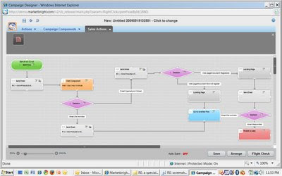
Marketbright's Campaign Flows Work Well for Serena Software

Summary: Serena Software is pleased with Marketbright's Visio-style interface for complex campaigns. The real work is in designing the campaigns, not setting them up in the software.

(Second of three posts on demand generation interfaces.)

I spoke last week with Marketbright client Michaline Todd, director of corporate marketing at Serena Software, to see how Serena likes Marketbright’s campaign interface. Marketbright uses the two-level approach that I consider an industry best practice: users can build simple linear campaigns with a wizard-driven interface, and embed these in a Visio-style flow chart to manage flows across campaigns.

The short answer is that Serena is very pleased, since the flows make it easier to enforce complex processing rules that were otherwise difficult to define and execute. The long answer adds a few shades of gray to this rosy picture, and these are worth exploring.

- Serena didn’t build the complex campaigns for themselves. The work was done by an outside agency, Maratona Marketing. The reason was not the Marketbright interface: of the six weeks it took to develop the company's first complex flow campaign, setting it up in Marketbright took twenty minutes. Maratona spent the rest of the time on business issues such as lead scoring, process flow and content creation. This reinforces the point that most companies will need help to take advantage of the new opportunities that demand generation systems present.

- Todd felt the campaign flows were “as easy as Visio”. She meant this as praise, although I suspect that many marketers don’t find Visio all that easy. In particular, Todd said the visual diagrams helped to explain the flows to marketing and sales managers who would otherwise find them hard to grasp. Todd also noted that Serena itself sells software development tools, so its staff is already very comfortable with flow charts.

- Serena is now running into conflicts when a given prospect is in more than one marketing campaign. Marketbright handles this now by limiting each prospect to one message per day, storing any additional messages, and sending them later. The vendor plans to refine this approach by letting users prioritize the campaigns so the most important messages are sent first.

Todd cited a couple other features she appreciated. These include a “flight check” of all components before the campaign is executed and an option to view results of active campaigns by clicking on icons in the flow chart. She didn’t mention some of the limits I noted in my Raab Guide analysis of Marketbright, such as a maximum of two splits leading from any decision within the flow or the inability to create random tests without SQL coding.

We did discuss testing in general. Todd said her company doesn’t run formal a/b tests although it does review the performance of different messages to see which yield higher response. She hinted that she might add testing later but was wary of creating too much complexity in the company’s first flows. Marketbright president Erik Bower reinforced this comment, suggesting that most marketers are too busy to analyze results from many tests. Instead, Marketbright plans to add “self-optimizing” capabilities similar to Google AdWords, which will let marketers load alternative versions and have the system automatically select the better-performing option over time.

We also discussed whether an automated lead nurturing campaign can build a relationship between a prospect and the sales rep whose name is on the system-generated emails. Both Todd and Maratona’s Cari Baldwin told stories about prospects who believed the emails werebeing sent personally. This is good news for companies hoping that demand generation systems can compensate for the loss of direct contact between sales people and early-stage prospects. (See my recent white paper Restoring the Balance for more on this.) But the stories also raise a note of caution: in both cases, the prospect approached the actual sales rep at a trade show, and the rep had no idea what they were talking about. Happily, both reps handled the situation well.

(Note: MarketBright was purchased by Act-On Software two years after this post was published.)

Silverpop Engage B2B Adds Visual Campaign Builder

Summary: Silverpop Engage B2B has added an innovative visual campaign builder that supports complexity without the drawbacks of a Visio-style flow chart. Thumbs up.

(This is the first of three planned posts on updated interfaces from demand generation vendors.)

Silverpop Engage B2B (formerly Vtrenz) on Monday released its first visual campaign builder, finally matching a feature offered by nearly all its competitors. The interface takes a creative approach to the conflict between simple presentation and complex campaign flows, using what Silverpop describes as “horizontal video-production-style features” that lay out each contact stream in a separate row on the screen. Movement between streams is handled by objects that list the destinations, but don’t connect to them with lines like a conventional, Visio-style flow chart. (Click here for a video demonstration.)

Silverpop told me that they had originally planned to use a Visio-style approach but found the diagrams became unworkably complex once they expanded beyond a few branches. Since this matches my own oft-stated opinion, I readily agreed.

It also can’t have hurt that the Engage B2B was already organized around contact streams, which it calls “tracks”, and rules to direct movement between streams, which it calls “track routes”. This fits perfectly with the new interface. In fact, “track” is precisely the term that audio, video and film producers use to describe their synchronized inputs. Think “sound track” or “8 track tape”. But I digress.


The ability to explicitly direct leads from one contact stream to another is what separates the Engage B2B approach from simple linear campaign flows. In the new interface, track routes are objects within the contact stream, and can be opened to edit the decision rules that determine where the lead moves next. The stream can also contain decision objects with a single rule that is tested repeatedly during a specified evaluation period. This allows the system to wait for an event (e.g., allow one week for response to an email) and still react immediately if it happens. If the rule is not met by the end of the evaluation period, the lead can move to the end of the track, to another track within the campaign, or to another campaign.

The interface includes a variety of thoughtful details that have a major impact on usability.

- A track can include placeholder objects, letting users design a campaign before its marketing materials are ready. Since this raises its own risks, the system flags incomplete objects so users know which still need work.

- Users can hover over the list of destination tracks within a track route object and then click on a destination to move to it.

- When events are based on fixed dates, as in a Webinar promotion, the objects in the different tracks are vertically aligned by date. This makes it easier to grasp what happens when.

- Once a campaign is under way, the system displays actual metrics on the track objects (responses, leads currently in the object, leads that have passed through, etc.) so users can see the results at a glance.

- The rule definition interface offers a wide variety of pre-formatted, fill-in-the-blanks statements. This lets non-technical users build complex rules, since it spares them from learning about database details or programming syntax.

Of course, no interface is perfect. There is no visual overview of how leads move across tracks and campaigns, which can make the flow hard to grasp. Nor is there an alternative, more concise interface for simple linear campaigns. The system doesn’t seem to adapt to different user skill levels or to adjust which options are exposed, although I might have missed some of these features.

Still, the Engage B2B interface represents a much-needed fresh look at solving some of the basic issues in campaign visualization. It definitely raises the bar for the rest of the industry.