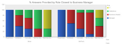
The mechanics are no big deal, but getting it to look right took some doing. I started with a simple version of the table I described in the earlier post, a matrix comparing business intelligence questions (tasks) vs. the roles of the people who can answer them.
Per Friday's post, I listed four roles: business managers, business analysts, statisticians, and IT specialists. The fundamental assumption is that each question will be answered by the person closest to business managers, who are the ultimate consumers. In other words, starting with the business manager, each person answers a question if she can, or passes it on to the next person on the list.
I defined five types of tasks, based on the technical resources needed to get an answer. These are:
- Read an Existing Report: no work is involved; business managers can answer all these questions themselves.
- Drilldown in Existing Report: this requires accessing data that has already been loaded into a business intelligence system and preppred for access. Business managers can do some of this for themselves, but most will be done by business analysts who are more fluent with the business intelligence product.
- Calculate from Existing Report: this requires copying data from an existing report and manipulating it in Excel or something more substantial. Business managers can do some of this, but more complex analyses are performed by business analysts or sometimes statisticians.
- Ad Hoc Analyze in Existing: this requires accessing data that has already been made available for analysis, but is not part of an existing reporting or business intelligence output. Usually this means it resides in a data warehouse or data mart. Business managers don't have the technical skills to get at this data. Some may be accessible to analysts, more will be available to statisticians, and a remainder will require help from IT.
- Add New Data: this requires adding data to the underlying business intelligence environment, such as putting a new source or field in a data warehouse. Statisticians can do some of this but most of the time it must be done by IT.
The table below shows the numbers I assigned to each part of this matrix. (Sorry the tables are so small. I haven't figured out how to make them bigger in Blogger. You can click on them for a full-screen view.) Per the preceding definitions, they numbers represent the percentage of questions of each type that can be answered by each sort of user. Each row adds to 100%.

I'm sure you recognize that these numbers are VERY scientific.
I then did a similar matrix representing a situation where QlikTech was available. Essentially, things move to the left, because less technically skilled users gain more capabilities. Specifically,
- There is no change for reading reports, since the managers could already do that for themselves.
- Pretty much any drilldown now becomes accessible to business managers or analysts, because QlikTech makes it so easy to add new drill paths.
- Calculations on existing data don't change for business managers, since they won't learn the finer points of QlikTech or even have the licenses needed to do really complicated things. But business analysts can do a lot more than with Excel. There are still some things that need a statistician's help.
- A little ad hoc analysis becomes possible for business managers, but business analysts gain a great deal of capability. Again, some work still needs a statistician.
- Adding new data now becomes possible in many cases for business analysts, since they can connect directly to data sources that would otherwise have needed IT support or preparation. Statisticians can also pick up some of the work. The rest remains with IT.
Here is the revised matrix:

So far so good. But now for the graph itself. Just creating a bar chart of the raw data didn't give the effect I wanted.

Yes, if you look closely, you can see that business managers and business analysts (blue and red bars) gain the most. But it definitely takes more concentration than I'd like.
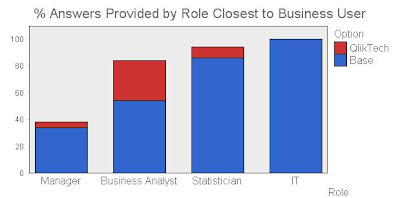
What I really had in mind was a single set of four bars, one for each role, showing how much capability it gained when QlikTech was added. This took some thinking. I could add the scores for each role to get a total value. The change in that value is what I want to show, presumably as a stacked bar chart. But you can't see that when the value goes down. I ultimately decided that the height of the bar should represent the total capability of each role: after all, just because statisticians don't have to read reports for business managers, they still can do it for themselves. This meant adding the values for each row across, so each role accumulated the capabilities of less technical rows to their left. So, the base table now looked like:

The sum of each column now shows the total capability available to each role. A similar calculation and sum for the QlikTech case shows the capability after QlikTech is added. The Change between the two is each role's gain in capability.

Now we have what I wanted. Start with the base value and stack the change on top of it, and you see very clearly how the capabilities shift after adding QlikTech.

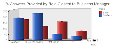
I did find one other approach that I may even like better. This is to plot the sums of the two cases for each group in a three-way bar chart, as below. I usually avoid such charts because they're so hard to read. But in this case it does show both the shift of capability to the left, and the change in workload for the individual roles. It's a little harder to read but perhaps the extra information is worth it.

Obviously this approach to understanding software value can be applied to anything, not just QlikTech. I'd be interested to hear whether anybody else finds it useful.
Fred, this means you.


No comments:
Post a Comment