(This is the first of three planned posts on updated interfaces from demand generation vendors.)
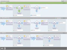
Silverpop Engage B2B (formerly Vtrenz) on Monday released its first visual campaign builder, finally matching a feature offered by nearly all its competitors. The interface takes a creative approach to the conflict between simple presentation and complex campaign flows, using what Silverpop describes as “horizontal video-production-style features” that lay out each contact stream in a separate row on the screen. Movement between streams is handled by objects that list the destinations, but don’t connect to them with lines like a conventional, Visio-style flow chart. (Click here for a video demonstration.)
Silverpop told me that they had originally planned to use a Visio-style approach but found the diagrams became unworkably complex once they expanded beyond a few branches. Since this matches my own oft-stated opinion, I readily agreed.
It also can’t have hurt that the Engage B2B was already organized around contact streams, which it calls “tracks”, and rules to direct movement between streams, which it calls “track routes”. This fits perfectly with the new interface. In fact, “track” is precisely the term that audio, video and film producers use to describe their synchronized inputs. Think “sound track” or “8 track tape”. But I digress.

The ability to explicitly direct leads from one contact stream to another is what separates the Engage B2B approach from simple linear campaign flows. In the new interface, track routes are objects within the contact stream, and can be opened to edit the decision rules that determine where the lead moves next. The stream can also contain decision objects with a single rule that is tested repeatedly during a specified evaluation period. This allows the system to wait for an event (e.g., allow one week for response to an email) and still react immediately if it happens. If the rule is not met by the end of the evaluation period, the lead can move to the end of the track, to another track within the campaign, or to another campaign.
The interface includes a variety of thoughtful details that have a major impact on usability.
- A track can include placeholder objects, letting users design a campaign before its marketing materials are ready. Since this raises its own risks, the system flags incomplete objects so users know which still need work.
- Users can hover over the list of destination tracks within a track route object and then click on a destination to move to it.
- When events are based on fixed dates, as in a Webinar promotion, the objects in the different tracks are vertically aligned by date. This makes it easier to grasp what happens when.
- Once a campaign is under way, the system displays actual metrics on the track objects (responses, leads currently in the object, leads that have passed through, etc.) so users can see the results at a glance.
- The rule definition interface offers a wide variety of pre-formatted, fill-in-the-blanks statements. This lets non-technical users build complex rules, since it spares them from learning about database details or programming syntax.
Of course, no interface is perfect. There is no visual overview of how leads move across tracks and campaigns, which can make the flow hard to grasp. Nor is there an alternative, more concise interface for simple linear campaigns. The system doesn’t seem to adapt to different user skill levels or to adjust which options are exposed, although I might have missed some of these features.
Still, the Engage B2B interface represents a much-needed fresh look at solving some of the basic issues in campaign visualization. It definitely raises the bar for the rest of the industry.
No comments:
Post a Comment