Summary: The first two posts in this series described my scoring for product fit. The third and final post describes scoring for vendor strength. And I'll give a little preview of the charts these scores produce...without product names attached.
Beyond assessing a vendor's current product, buyers also want to understand the current and future market position of the vendor itself. I had much less data to work with relating to vendor strength and there are many fewer conceptual issues. From a buyer’s perspective, the big questions about vendors are whether they’ll remain in business, whether they’ll continue to support and update the product, and whether they understand the needs of customers like me.
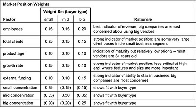
As with product fit, I used different weights for different types of buyers. As you'll see below, the bulk of the weight was assigned to concentration within each market. This reflects the fact that buyers really do want vendors who have experience with similar companies. Specific rationales are in the table. I converted the entries to the standard 0-2 scale and originally required the weights to add to 100. This changed when I added negative scoring to sharpen distinctions among vendor groups.
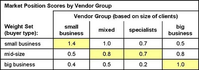
These weights produced a reasonable set of vendor group scores – small vendors scored best for small buyers, mixed and special vendors scored best for mid-size buyers, and big vendors scored best for big buyers. QED.
I should stress that all the score development I've described in these posts was done by looking at the vendor groups, not at individual vendors. (Well, maybe I peeked a little.) The acid test is when the individual vendors scores are plotted -- are different kinds of vendors pretty much where expected, without each category being so tightly clustered together that there's no meaningful differentiation?
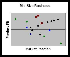
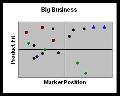
The charts below show the results, without revealing specific vendor names. Instead, I've color-coded the points (each representing one vendor) using the same categories as before: green for small business vendors, black for mixed vendors, violet for specialists, and blue for big company vendors.
As you can see, the blue and green dots do dominate the upper right quadrants of their respective charts. The other colors are distributed in intriguing positions that will be very interesting indeed once names are attached. This should happen in early to mid January, once I finish packaging the data into a proper report. Stay tuned, and in the meantime have a Happy New Year.
Wednesday, December 29, 2010
Tuesday, December 28, 2010
Ranking B2B Marketing Automation Vendors: Part 2
Summary: Yesterday's post described the objectives of my product fit scores for B2B marketing automation vendors and how I set up the original weighting for individual elements. But the original set of scores seemed to favor more complex products, even for small business marketers. Here's how I addressed the problem.
Having decided that my weights needed adjusting, I wanted an independent assessment of which features were most appropriate for each type of buyer. I decided I could base this on the features each set of vendors provided. The only necessary assumption is that vendors offer the features that their target buyers need most. That seems like a reasonable premise -- or at least, more reliable than just applying my own opinions.
For this analysis, I first calculated the average score for each feature in each vendor group. Remember that I was working with a matrix of 150+ features for each vendor, each scored from 0 to 2 (0=not provided, 1=partly provided, 2=fully provided). A higher average means that more vendors provide the feature.
I then sorted the feature list based on average scores for the small business vendors. This put the least common small business features at the top and the most common at the bottom. I divided the list into six roughly-equal sized segments, representing feature groups that ranged from rare to very common. The final two segments both contained features shared by all small business vendors. One segment had features that were also shared by all big business vendors; the other had features that big business vendors didn't share. Finally, I calculated an average score for the big business vendors for each of the six groups.
What I found, not surprisingly, was that some features are more common in big-company systems, some are in all types of systems, and a few are concentrated among small-company systems. In each group, the intermediate vendors (mixed and special) had scores between the small and large vendor scores. This is additional confirmation that the groupings reflect a realistic ranking by buyer needs (or, at least, the vendors’ collective judgment of those needs).
The next step was to see whether my judgment matched the vendors’. Using the same feature groups, I calculated the aggregate weights I had already assigned to the those features for each buyer type. Sure enough, the big business features had the highest weights in the big business set, and the small business weights got relatively larger as you moved towards the small business features. The mid-size weights were somewhere in between, exactly where they should have been. Hooray for me!
Self-congratulation aside, we now have firmer ground for adjusting the weights to distinguish systems for different types of buyers. Remember, the small business scores in particular weren’t very different for the different vendor groups, and actually gave higher scores to big business vendors once you removed the adjustment for price. (As you may have guessed, most features in the “more small” group are price-related – proving, as if proof were necessary, that small businesses are very price sensitive.)
From here, the technical solution here is quite obvious: assign negative weights to big business features in the small business weight set. This recognizes that unnecessary features actually reduce the value of a system by making it harder to use. The caveat is that different users need different features. But that's why we have different weight sets in the first place.
(As an aside, it’s worth exploring why only assigning lower weights to the unnecessary features won’t suffice. Start with the fact that even a low weight increases rather than reduces a product score, so products with more features will always have a higher total. This is a fundamental problem with many feature-based scoring systems. In theory, assigning higher weights to other, more relevant factors might overcome this, but only if those features are more common among the simpler systems. In practice, most of the reassigned points will go to basic features which are present in all systems. This means the advanced systems get points for all the simple features plus the advanced features, while simple systems get points for the simple features only. So the advanced systems still win. That's just what happened with my original scores.)
Fortified with this evidence, I revisited my small business scoring and applied negative weights to items I felt were important only to large businesses. I applied similar but less severe adjustments to the mid-size weight set. The mid-size weights were in some ways a harder set of choices, since some big-company features do add value for mid-size firms. Although I worked without looking at the feature groups, the negative scores were indeed concentrated among the features in the large business groups:
I used the adjusted weights to create new product fit scores. These now show much more reasonable relationships across the vendor groups: that is, each vendor group has the highest scores for its primary buyer type and there’s a big difference between small and big business vendors. Hooray for me, again.
One caveat is that negative scores mean that weights in each set no longer add to 100%. This means that scores from different weight sets (i.e., reading down the chart) are no longer directly comparable. There are technical ways to solve this, but it's not worth the trouble for this particular project.
Tomorrow I'll describe the vendor fit scores. Mercifully, they are much simpler.
Monday, December 27, 2010
Ranking B2B Marketing Automation Vendors: How I Built My Scores (part 1)
Summary: The first of three posts describing my new scoring system for B2B marketing automation vendors.
I’ve finally had time to work up the vendor scores based on the 150+ RFP questions I distributed back in September. The result will be one of those industry landscape charts that analysts seem pretty much obliged to produce. I have never liked those charts because so many buyers consider only the handful of anointed “leaders”, even though one of the less popular vendors might actually be a better fit. This happens no matter how loudly analysts warn buyers not to make that mistake.
On the other hand, such charts are immensely popular. Recognizing that buyers will use the chart to select products no matter what I tell them, I settled on dimensions that are directly related to the purchase process:
- product fit, which assesses how well a product matches buyer needs. This is a combination of features, usability, technology, and price.
- vendor strength, which assesses a vendor’s current and future business position. This is a combination of company size, client base, and financial resources.
These are conceptually quite different from the dimensions used in the Gartner and Forrester reports* , which are designed to illustrate competitive position. But I’m perfectly aware that only readers of this blog will recognize the distinction. So I've also decided to create three versions of the chart, each tailored to the needs of different types of buyers.
In the interest of simplicity, my three charts will address marketers at small, medium and big companies. The labels are really short-hand for the relative sophistication and complexity of user requirements. But if I explicitly used a scale from simple to sophisticated, no one would ever admit that their needs were simple -- even to themselves. I've hoping the relatively neutral labels will encourage people to be more realistic. In practice, we all know that some small companies are very sophisticated marketers and some big companies are not. I can only hope that buyers will judge for themselves which category is most appropriate.
The trick to producing three different rankings from the same set of data is to produce three sets of weights for the different elements. Raab Associates’ primary business for the past two decades has been selecting systems, so we have a well-defined methodology for vendor scoring.
Our approach is to first set the weights for major categories and then allocate weights within those categories. The key is that the weights must add to 100%. This forces trade-offs first among the major categories and then among factors within each category. Without the 100% limit, two things happen:
- everything is listed as high priority. We consistently found that if you ask people to rate features as "must have" "desirable" and "not needed", 95% of requirements are rated as “must have”. From a prioritization standpoint, that's effectively useless.
- categories with many factors are overweighted. What happens is that each factor gets at least one point, giving the category a high aggregate total. For example, category with five factors has a weight of at least five, while a category with 20 factors has a weight of 20 or more.
The following table shows the major weights I assigned. The heaviest weight goes to lead generation and nurturing campaigns – a combined 40% across all buyer types. I weighted pricing much more heavily for small firms, and gabe technology, lead scoring and technology heavier weights at larger firms. You’ll notice that Vendor is weighted at zero in all cases: remember that these are weights for product fitness scores. Vendor strength will be scored on a separate dimension.
I think these weights are reasonable representations of how buyers think in the different categories. But they’re ultimately just my opinion. So I also created a reality check by looking at vendors who target the different buyer types.
This was possible because the matrix asked vendors to describe their percentage of clients in small, medium and large businesses. (The ranges were under $20 million, $20 million to $500 million, and over $500 million annual revenue.) Grouping vendors with similar percentages of small clients yielded the following sets:
- small business (60% or more small business clients): Infusionsoft, OfficeAutoPilot, TrueInfluence
- mixed (33-66% small business clients): Pardot, Marketo, Eloqua, Manticore Technology, Silverpop, Genius
- specialists (15%-33% small business): LeadFormix, TreeHouse Interactive, SalesFUSION
- big clients (fewer than 15% small business): Marketbright, Neolane, Aprimo On Demand
(I also have data from LoopFuse, Net Results, and HubSpot, but didn’t have the client distribution for the first two. I excluded HubSpot because it is a fundamentally different product.)
If my weights were reasonable, two things should happen:
- vendors specializing in each client type should have the highest scores for that client type (that is, small business vendors have higher scores than big business vendors using the small business weights.)
- vendors should have their highest scores for their primary client type (that is, small business vendors should have higher scores with small business weights than with big business weights).
As the table below shows, that is pretty much what happened:
So far so good. But how did I know I’d assigned the right weights to the right features?
I was particularly worried about the small business weights. These showed a relatively small difference in scores across the different vendor groups. In addition, I knew I had weighted price heavily. In fact, it turned out that if I took price out of consideration, the other vendor groups would actually have higher scores than the small business specialists. This couldn't be right: the other systems are really too complicated for small business users, regardless of price.
Clearly some adjustments were necessary. I'll describe how I handled this in tomorrow's post.
_______________________________________________________
* “ability to execute” and “completeness of vision” for Gartner, “current offering”, “market presence” and “strategy” for Forrester.
Wednesday, December 22, 2010
Teradata Buys Aprimo for $525 Million: More Marketing Automation Consolidation To Come
Summary: Teradata's acquisition of Aprimo takes the largest remaining independent marketing automation vendor off the market. The market will probably split between enterprise-wide suites and more limited marketing automation systems.
Teradata announced today that is acquiring marketing automation vendor Aprimo for a very hefty $525 million – even more than the $480 million that IBM paid for somewhat larger Unica in August.
Given the previous Unica deal. other recent marketing system acquisitions, and wide knowledge that Aprimo was eager to sell, no one is particularly surprised by this transaction. Teradata is a logical buyer, having a complementary campaign management system but lacking Aprimo’s marketing resource management, cloud-based technology and strong B2B client base (although Aprimo has stressed to me more than once that 60% of their revenue is from B2C clients).
This is obviously a huge decision for Teradata, a $1.7 billion company compared with IBM’s $100 billion in revenue. It stakes a claim to a piece of the emerging market for enterprise-wide marketing systems, the same turf targeted in recent deals by IBM, Oracle, Adobe and Infor (and SAS and SAP although they haven’t made major acquisitions).
This enterprise market is probably going to evolve into something distinct from traditional “marketing automation”. The difference: marketing automation is focused on batch and interactive campaign management but just touches slightly on advertising, marketing resource management and analytics. The enterprise market involves unified systems sold at the CEO, CFO, CIO and CMO levels, whereas marketing automation has been sold largely to email and Web marketers within marketing departments.
The existence of C-level buyers for marketing systems is not yet proven, and I remain a bit of a skeptic. But many smart people are betting a lot of money that it will appear, and will spend more money to make it happen. Aprimo is probably the vendor best positioned to benefit because its MRM systems inherently work across an entire marketing department (although I’m sure many Aprimo deployments are more limited). So, in that sense at least, Teradata has positioned itself particularly well to take advantage of the new trend. And if IBM and Oracle want to invest in developing that market so that Teradata can benefit, so much the better for Teradata.
That said, there's still some question whether Teradata can really benefit if this market takes off. Aprimo adds a great deal of capability, but the combined company still lacks the strong Web analytics and BI applications of its main competitors. A closer alliance with SAS might fill that gap nicely...and acquisition or merger between the two firms is perfectly conceivable, at least superficially. Lack of professional services is perhaps less an issue since it makes Teradata a more attractive partner to the large consulting firms (Accenture, CapGemini, etc.) who already use its tools and must be increasingly nervous about competition from IBM’s services group.
The other group closely watching these deals are the remaining marketing automation vendors themselves. Many would no doubt be delighted to sell at such prices. But, as Eloqua’s Joe Payne points out in his own comment on the Aprimo deal, the remaining vendors are all much smaller: while Unica and Aprimo each had around $100 million revenue, Eloqua and Alterian are around $50 million, Neolane and SmartFocus are $20-$30 million, and Marketo said recently it expects nearly $15 million in 2010. I doubt any of the others reach $10 million. (This excludes email companies like ExactTarget, Responsys and Silverpop [which does have a marketing automation component].) Moreoever, the existing firms skew heavily to B2B clients and smaller companies, which are not the primary clients targeted by big enterprise systems vendors.
That said, I do expect continued acquisitions within this space. I’d be surprised to see the 4-5x revenue price levels of the Unica and Aprimo deals, but even lower valuations would be attractive to owners and investors facing increasingly cut-throat competition. As I’ve written many times before, the long-term trend will be for larger CRM and Web marketing suites to incorporate marketing automation functions, making stand-alone marketing automation less competitive. Survivors will offer features for particular industries or specialized functions that justify purchase outside of the corporate standard. And the real money will be made by service vendors who can help marketers fully benefit from these systems.
Sunday, December 12, 2010
Predictions for B2B Marketing in 2011
I don't usually bother with the traditional "predictions for next year" piece at this time of year. But I happened to write one in response to a question at the Focus online community last week. So I figured I'd share it here as well.
Summary: 2011 will see continued adjustment as B2B lead generators experiment with the opportunities provided by new media.
1. Marketing automation hits an inflection point, or maybe two. Mainstream B2B marketers will purchase marketing automation systems in large numbers, having finally heard about it often enough to believe it's worthwhile. But many buyers will be following the herd without understanding why, and as a result will not invest in the training, program development and process change necessary for success. This will eventually lead to a backlash against marketing automation, although that might not happen until after 2011.
2. Training and support will be critical success factors. Whether or not they use marketing automation systems, marketers will increasingly rely on external training, consultants and agencies to help them take advantage of the new possibilities opened by changes in media and buying patterns. Companies that aggressively seek help in improving their skills will succeed; those who try to learn everything for themselves by trial-and-error will increasingly fall behind the industry. Marketing automation vendors will move beyond current efforts at generic industry education to provide one-on-one assistance to their clients via their own staff, partners, and built-in system features that automatically review client work, recommend changes and sometimes implement them automatically. (Current examples: Hubspot's Web site grader for SEO, Omniture Test & Target for landing page optimization, Google AdWords for keyword and copy testing.)
3. Integration will be the new mantra. Marketers will struggle to incorporate an ever-expanding array of online marketing options: not just Web sites and email, but social, mobile, location-based, game-based, app-based, video-based, and perhaps even base-based. Growing complexity will lead them to seek integrated solutions that provide a unified dashboard to view and manage all these media. Vendors will scramble to fill this need. Competitors will include existing marketing automation and CRM systems seeking to use their existing functions as a base, and entirely new systems that provide a consistent interface to access many different products transparently via their APIs.
4. SMB systems will lead the way. Systems built for small businesses will set the standard for ease of use, integration, automation and feedback. Lessons learned from these systems will be applied by their developers and observant competitors to help marketers at larger companies as well. But enterprise marketers have additional needs related to scalability, content sharing and user rights management, which SMB systems are not designed to address. Selling to enterprises is also very different from selling to SMBs. So the SMB vendors themselves won't necessarily succeed at moving upwards to larger clients.
5. Social marketing inches forward. Did you really think I'd talk about trends without mentioning social media? Marketers in 2011 will still be confused about how to make best use of the many opportunities presented by social media. Better tools will emerge to simplify and integrate social monitoring, response and value measurement. Like most new channels, social will at first be treated as a separate specialty. But advanced firms will increasingly see it as one of many channels to be managed, measured and eventually integrated with the rest of their marketing programs. Social extensions to traditional marketing automation systems will make this easier.
6. The content explosion implodes: marketers will rein in runaway content generation by adopting a more systematic approach to understanding the types of content needed for different customer personas at different stages in the buying cycle. Content management and delivery systems will be mapped against these persona/stage models to simplify delivery of the right content in the right situation. Marketers will develop small, reusable content "bites" that can be assembled into custom messages, thereby both reducing the need for new content and enabling more appropriate customer treatments. Marketers will also be increasingly insistent on measuring the impact of their messages, so they can use the results to improve the quality of their messages and targeting. Since this measurement will draw on data from multiple systems, including sales and Web behaviors, it will occur in measurement systems that are outside the delivery systems themselves.
7. Last call for last click attribution: marketers will seriously address the need to show the relationship between their efforts and revenue. This will force them to abandon last-click attribution in favor of methods that address the impact of all treatments delivered to each lead. Different vendors and analysts will propose different techniques to do this, but no single standard will emerge before the end of 2011.
Wednesday, December 08, 2010
Case Study: Using a Scenario to Select Business Intelligence Software
Summary: Testing products against a scenario is critical to making a sound selection. But the scenario has to reflect your own requirements. While this post shows results from one test, rankings could be very different for someone else.
I’m forever telling people that the only reliable way to select software is to devise scenarios and test the candidate products against them. I recently went through that process for a client and thought I’d share the results.
1. Define Requirements. In this particular case, the requirements were quite clear: the client had a number of workers who needed a data visualization tool to improve their presentations. These were smart but not particularly technical people and they only did a couple of presentations each month. This mean the tool had to be extremely easy to use, because the workers wouldn’t find time for extensive training and, being just occasional users, would quickly forget most of they had learned. They also wanted to do some light ad hoc analysis within the tool, but just on small, summary data sets since the serious analytics are done by other users earlier in the process. And, oh, by the way, if the same tool could provide live, updatable dashboards for clients to access directly, that would be nice too. (In a classic case of scope creep, the client later added mapping capabilities to the list, merging this with a project that had been running separately.)
During our initial discussions, I also mentioned that Crystal Xcelsius (now SAP Crystal Dashboard Design) has the very neat ability to embed live charts within Powerpoint documents. This became a requirement too. (Unfortunately, I couldn’t find a way to embed one of those images directly within this post, but you can click here to see a sample embedded in a pdf. Click on the radio buttons to see the different variables. How fun is that?)
2. Identify Options. Based on my own knowledge and a little background research, I built a list of candidate systems. Again, the main criteria were visualization, ease of use and – it nearly goes without saying – low cost. A few were eliminated immediately due to complexity or other reasons. This left:
3. Define the Scenario. I defined a typical analysis for the client: a bar chart comparing index values for four variables across seven customer segments. The simplest bar chart showed all segment values for one variable. Another shows all variables for all segments, sorted first by variable and then by segment, with the segments ranked according to response rate (one of the five variables). This would show how the different variables related to response rate. It looked like this:
The tasks to execute the scenario were:
4. Results. I was able to download free or trial versions of each system. I installed these and then timed how long it took to complete the scenario, or at least to get as far as I could before reaching the frustration level where a typical end-user would stop.
I did my best to approach each system as if I’d never seen it before, although in fact, I’ve done at least some testing on every product except SpotFire, and have worked extensively with Xcelsius and QlikView. As a bit of a double-check, I dragooned one of my kids into testing one system when he was innocently visiting home over Thanksgiving: his time was actually quicker than mine. I took that as a proof I'd tested fairly.
Notes from the tests are below.
5. Final Assessment. Although the scenario nicely addressed ease of use, there were other considerations that played into the final decision. These required a bit more research and some trade-offs, particularly regarding the Xcelsius-style ability to embed interactive charts within a Powerpoint slide. No one else on the list could do this without either loading additional software (often a problem when end-user PCs are locked down by corporate IT) or accessing an external server (a problem for mobile users and with license costs).
The following table shows my results:
6. Next Steps. The result of this project wasn’t a final selection, but a recommendation of a couple of products to explore in depth. There were still plenty of details to research and confirm. However, starting with a scenario greatly sped up the work, narrowed the field, and ensured that the final choice would meet operational requirements. That was well worth the effort. I strongly suggest you do the same.
____________________________________
* The actual data looked like this. Here's a link if you want to download it:
I’m forever telling people that the only reliable way to select software is to devise scenarios and test the candidate products against them. I recently went through that process for a client and thought I’d share the results.
1. Define Requirements. In this particular case, the requirements were quite clear: the client had a number of workers who needed a data visualization tool to improve their presentations. These were smart but not particularly technical people and they only did a couple of presentations each month. This mean the tool had to be extremely easy to use, because the workers wouldn’t find time for extensive training and, being just occasional users, would quickly forget most of they had learned. They also wanted to do some light ad hoc analysis within the tool, but just on small, summary data sets since the serious analytics are done by other users earlier in the process. And, oh, by the way, if the same tool could provide live, updatable dashboards for clients to access directly, that would be nice too. (In a classic case of scope creep, the client later added mapping capabilities to the list, merging this with a project that had been running separately.)
During our initial discussions, I also mentioned that Crystal Xcelsius (now SAP Crystal Dashboard Design) has the very neat ability to embed live charts within Powerpoint documents. This became a requirement too. (Unfortunately, I couldn’t find a way to embed one of those images directly within this post, but you can click here to see a sample embedded in a pdf. Click on the radio buttons to see the different variables. How fun is that?)
2. Identify Options. Based on my own knowledge and a little background research, I built a list of candidate systems. Again, the main criteria were visualization, ease of use and – it nearly goes without saying – low cost. A few were eliminated immediately due to complexity or other reasons. This left:
3. Define the Scenario. I defined a typical analysis for the client: a bar chart comparing index values for four variables across seven customer segments. The simplest bar chart showed all segment values for one variable. Another shows all variables for all segments, sorted first by variable and then by segment, with the segments ranked according to response rate (one of the five variables). This would show how the different variables related to response rate. It looked like this:
The tasks to execute the scenario were:
- connect to a simple Excel spreadsheet (seven segments x four variables.)*
- create a bar chart showing data for all segments for a single variable.
- create a bar chart showing data for all segments for all variables, clustered by variable and sorted by the value of one variable (response index).
- provide users with an option to select or highlight individual variables and segments.
4. Results. I was able to download free or trial versions of each system. I installed these and then timed how long it took to complete the scenario, or at least to get as far as I could before reaching the frustration level where a typical end-user would stop.
I did my best to approach each system as if I’d never seen it before, although in fact, I’ve done at least some testing on every product except SpotFire, and have worked extensively with Xcelsius and QlikView. As a bit of a double-check, I dragooned one of my kids into testing one system when he was innocently visiting home over Thanksgiving: his time was actually quicker than mine. I took that as a proof I'd tested fairly.
Notes from the tests are below.
- Xcelsius (SAP Crystal Dashboard Design): 3 hours to set up bar chart with one variable and allowing selection of individual variables. Did not attempt to create chart showing multiple variables. (Note: most of the time was spent figuring out how Xcelsius did the variable selection, which is highly unintuitive. I finally had to cheat and use the help functions, and even then it took at least another half hour. Remember that Xcelsius is a system I’d used extensively in the past, so I already had some idea of what I was looking for. On the other hand, I reproduced that chart in just a few minutes when I was creating the pdf for this post. Xcelsius would work very well for a frequent user, but it’s not for people who use it only occasionally.)
- Advizor: 3/4 hour to set up bar chart. Able to show multiple variables on same chart but not to group or sort by variable. Not obvious how to make changes (must click on a pull down menu to expose row of icons).
- Spotfire: 1/2 hour to set up bar chart. Needed to read Help to put multiple lines or bars on same chart. Could not find way to sort or group by variable.
- QlikView: 1/4 hour to set up bar chart (using default wizard). Able to add multiple variables and sort segments by response index, but could not cluster by variable or expose menu to add/remove variables. Not obvious how to make changes (must right-click to open properties box – I wouldn’t have known this without my prior QlikView experience).
- Lyzasoft: 1/4 hour to set up bar chart with multiple variables. Able to select individual variables, cluster by variable and sort by response index, but couldn’t easily assign different colors to different variables (required for legibility). Annoying lag each time chart is redrawn.
- Tableau: 1/4 hour to set up bar chart with multiple variables. Able to select individual variables, cluster by variable, and sort by variable. Only system to complete the full scenario.
5. Final Assessment. Although the scenario nicely addressed ease of use, there were other considerations that played into the final decision. These required a bit more research and some trade-offs, particularly regarding the Xcelsius-style ability to embed interactive charts within a Powerpoint slide. No one else on the list could do this without either loading additional software (often a problem when end-user PCs are locked down by corporate IT) or accessing an external server (a problem for mobile users and with license costs).
The following table shows my results:
6. Next Steps. The result of this project wasn’t a final selection, but a recommendation of a couple of products to explore in depth. There were still plenty of details to research and confirm. However, starting with a scenario greatly sped up the work, narrowed the field, and ensured that the final choice would meet operational requirements. That was well worth the effort. I strongly suggest you do the same.
____________________________________
* The actual data looked like this. Here's a link if you want to download it:
Tuesday, December 07, 2010
Tableau Software Adds In-Memory Database Engine
Summary: Tableau has added a large-scale in-memory database engine to its data analysis and visualization software. This makes it a lot more powerful.
Hard to believe, but it's more than three years since my review of Tableau Software’s data analysis system. Tableau has managed quite well without my attention: sales have doubled every year and should exceed $40 million in 2010; they have 5,500 clients, 60,000 users and 185 employees; and they plan to add 100 more employees next year. Ah, I knew them when.
What really matters from a user perspective is that the product itself has matured. Back in 2007, my main complaint was that Tableau lacked a data engine. The system either issued SQL queries against an external database or imported a small data set into memory. This meant response time depended on the speed of the external system and that users were constrained by the external files' data structure.
Tableau’s most recent release (6.0, launched on November 10) finally changes this by adding a built-in data engine. Note that I said “changes” rather than “fixes”, since Tableau has obviously been successful without this feature. Instead, the vendor has built connectors for high-speed analytical databases and appliances including Hyperion Essbase, Greenplum, Netezza, PostgreSQL, Microsoft PowerPivot, ParAccel, Sybase IQ, Teradata, and Vertica. These provide good performance on any size database, but they still leave the Tableau user tethered to an external system. An internal database allows much more independence and offers high performance when no external analytical engine is present. This is a big advantage since such engines are still relatively rare and, even if a company has one, it might not contain all the right data or be accessible to Tableau users.
Of course, this assumes that Tableau's internal database is itself a high-speed analytical engine. That’s apparently the case: the engine is home-grown but it passes the buzzword test (in-memory, columnar, compressed) and – at least in an online demo – offered near-immediate response to queries against a 7 million row file. It also supports multi-table data structures and in-memory “blending” of disparate data sources, further freeing users from the constraints of their corporate environment. The system is also designed to work with data sets that are too large to fit into memory: it will use as much memory as possible and then access the remaining data from disk storage.
Tableau has added some nice end-user enhancements too. These include:
- new types of combination charts;
- ability to display the same data at different aggregation levels on the same chart (e.g., average as a line and individual observations as points);
- more powerful calculations including multi-pass formulas that can calculate against a calculated value
- user-entered parameters to allow what-if calculations
The Tableau interface hasn’t changed much since 2007. But that's okay since I liked it then and still like it now. In fact, it won a little test we conducted recently to see how far totally untrained users could get with a moderately complex task. (I'll give more details in a future post.)
Tableau can run either as traditional software installed on the user's PC or on a server accessed over the Internet. Pricing for a single user desktop system is still $999 for a version that can connect to Excel, Access or text files, and has risen slightly to $1,999 for one that can connect to other databases. These are perpetual license fees; annual maintenance is 20%.
There’s also a free reader that lets unlimited users download and read workbooks created in the desktop system. The server version allows multiple users to access workbooks on a central server. Pricing for this starts at $10,000 for ten users and you still need at least one desktop license to create the workbooks. Large server installations can avoid per-user fees by purchasing CPU-based licenses, which are priced north of $100,000.
Although the server configuration makes Tableau a candidate for some enterprise reporting tasks, it can't easily limit different users to different data, which is a typical reporting requirement. So Tableau is still primarily a self-service tool for business and data analysts. The new database, calculation and data blending features add considerably to their power.
Monday, December 06, 2010
QlikView's New Release Focuses on Enterprise Deployment
I haven’t written much about QlikView recently, partly because my own work hasn’t required using it and partly because it’s now well enough known that other people cover it in depth. But it remains my personal go-to tool for data analysis and I do keep an eye on it. The company released QlikView 10 in October and Senior Director of Product Marketing Erica Driver briefed me on it in a couple of weeks ago. Here’s what’s up.
- Business is good. If you follow the industry at all, you already know that QlikView had a successful initial public stock offering in July. Driver said the purpose was less to raise money than to gain the credibility that comes from being a public company. (The share price has nearly doubled since launch, incidentally.) The company has continued its rapid growth, exceeding 15,000 clients and showing 40% higher revenue vs. the prior year in its most recent quarter. Total revenues will easily exceed $200 million for 2010. Most clients are still mid-sized businesses, which is QlikView’s traditional stronghold. But more big enterprises are signing on as well.
- Features are stable. Driver walked me through the major changes in QlikView 10. From an end-user perspective, none were especially exciting -- which simply confirms that QlikView already had pretty much all the features it needed.
Even the most intriguing user-facing improvements are pretty subtle. For example, there’s now an “associative search” feature that means I can enter client names in a sales rep selection box and the system will find the reps who serve those clients. Very clever and quite useful if you think about it, but I’m guessing you didn’t fall off you chair when you heard the news.
The other big enhancement was a “mekko” chart, which is bar chart where the width of the bar reflects a data dimension. So, you could have a bar chart where the height represents revenue and the width represents profitability. Again, kinda neat but not earth-shattering.
Let me stress again that I’m not complaining: QlikView didn’t need a lot of new end-user features because the existing set was already terrific.
- Development is focused on integration and enterprise support. With features under control, developers have been spending their time on improving performance, integration and scalability. This involves geeky things aimed at like a documented data format for faster loads, simpler embedding of QlikView as an app within external Web sites, faster repainting of pages in the AJAX client, more multithreading, centralized user management and section access controls, better audit logging, and prebuilt connectors for products including SAP and Salesforce.com.
There’s also a new API that lets external objects to display data from QlikView charts. That means a developer can, say, put QlikView data in a Gantt chart even though QlikView itself doesn’t support Gantt charts. The company has also made it easier to merge QlikView with other systems like Google Maps and SharePoint.
These open up some great opportunities for QlikView deployments, but they depend on sophisticated developers to take advantage of them. In other words, they are not capabilities that a business analyst -- even a power user who's mastered QlikView scripts -- will be able to handle. They mark the extension of QlikView from stand-alone dashboards to a system that is managed by an IT department and integrated with the rest of the corporate infrastructure.
This is exactly the "pervasive business intelligence" that industry gurus currently tout as the future of BI. QlikView has correctly figured out that it must move in this direction to continue growing, and in particular to compete against traditional BI vendors at large enterprises. That said, I think QlikView still has plenty of room to grow within the traditional business intelligence market as well.
- Mobile interface. This actually came out in April and it’s just not that important in the grand scheme of things. But if you’re as superficial as I am, you’ll think it’s the most exciting news of all. Yes, you can access QlikView reports on iPad, Android and Blackberry smartphones, including those touchscreen features you’ve wanted since seeing Minority Report. The iPad version will even use the embedded GPS to automatically select localized information. How cool is that?
Labels:
business intelligence software,
qliktech,
qlikview
Thursday, December 02, 2010
HubSpot Expands Its Services But Stays Focused on Small Business
Summary: HubSpot has continued to grow its customer base and expand its product. It's looking more like a conventional small-business marketing automation system every day.
You have to admire a company that defines a clear strategy and methodically executes it. HubSpot has always aimed to provide small businesses with one easy-to-use system for all their marketing needs. The company began with search engine optimization to attract traffic, and added landing pages, blogging, Web hosting, lead scoring, and Salesforce.com integration. Since my July 2009 review, HubSpot has further extended the system to include social media monitoring and sharing, limited list segmentation and simple drip marketing campaigns. It is now working on more robust outbound email, support for mobile Web pages, and APIs for outside developers to create add-on applications.
The extension into email is a particularly significant step for HubSpot, placing it in more direct competition with other small business marketing systems like Infusionsoft, OfficeAutoPilot and Genoo. Of course, this competition was always implicit – few small businesses would have purchased HubSpot plus one of those products. But HubSpot’s “inbound marketing” message was different enough that most buyers would have decided based on their marketing priorities (Web site or email?). As both sets of systems expand their scope, their features will overlap more and marketers will compare them directly.
Choices will be based on individual features and supporting services. In terms of features, HubSpot still offers unmatched search engine optimization and only Genoo shares its ability to host a complete Web site (as opposed to just landing pages and microsites). On the other hand, HubSpot’s lead scoring, email and nurture campaigns are quite limited compared with its competitors. Web analytics, social media and CRM integration seem roughly equivalent.
One distinct disadvantage is that most small business marketing automation systems offer their own low-cost alternative to Salesforce.com, while HubSpot does not. HubSpot’s Kirsten Knipp told me the company has no plans to add this, relying instead on easy integration with systems like SugarCRM and Zoho. But I wouldn’t be surprised if they changed their minds.
In general, though, HubSpot’s growth strategy seems to rely more on expanding services than features. This makes sense: like everyone else, they've recognized that most small businesses (and many not-so-small businesses) don’t know how to make good use of a marketing automation program. This makes support essential for both selling and retaining them as customers.
One aspect of service is consulting support. HubSpot offers three pricing tiers that add service as well as features at the levels increase. The highest tier, still a relatively modest $18,000 per year, includes a weekly telephone consultation.
The company has also set up new programs to help recruit and train marketing experts who can resell the product and/or use it to support their own clients. These programs include sales training, product training, and certification. They should both expand HubSpot’s sales and provide experts to help buyers that HubSpot sells directly.
So far, HubSpot’s strategy has been working quite nicely. The company has been growing at a steady pace, reaching 3,500 customers in October with 98% monthly retention. A couple hundred of these are at the highest pricing tier, with the others split about evenly between the $3,000 and $9,000 levels. This is still fewer clients than Infusionsoft, which had more than 6,000 clients as of late September. But it's probably more than any other marketing automation vendor and impressive by any standard.
Monday, November 29, 2010
Treehouse Interactive Refines Its Features and Targets Larger Firms
Summary: Treehouse Interactive has been slowly enhancing its marketing automation system with features that appeal to experienced users. Its new clients are larger firms and half are switching from another marketing automation product that they found inadequate. This might foreshadow attrition problems at other vendors.
It’s been nearly two years since my last review of Treehouse Interactive. Here's an update.
The big news is, well, that there’s no big news. Treehouse has been quietly but steadily growing its business (up 30% this year), improving its product, and attracting more demanding clients. One telling statistic is that about half its new customers are replacing an existing marketing automation system – a sure sign that Treehouse offers features that only an experienced marketer will realize are missing from other products.
A bit of background: Treehouse started in 1997 with the Sales View sales automation product. It added Marketing View marketing automation in 1999 and Reseller View partner management after that. Its marketing automation system offers the usual range of functions: email, Web analytics, landing pages, multi-step campaigns, lead scoring, CRM integration, ROI reporting. The greatest divergence from industry norms is Treehouse contacts always enter campaigns by completing a form. Other systems select campaign members with rules that can access a broader set of data.
In addition, Treehouse originally required all subsequent campaign steps to execute the same actions on the same schedule. This is considerably more rigid than the branching capabilities built into most marketing automation products. Treehouse has since enabled imported data to trigger campaign actions, and promises behavior-based triggers in the near future. See my original post for more details.
Treehouse’s developments since that post have largely played to its strengths. I’ll group these into themes, with the caveat that I’m combining enhancements introduced at different times in the past year and a half.
- form integration. Treehouse has continued to expand how clients can use its forms, which were already more powerful than most. The system can now generate HTML code to embed forms within external Web pages, allowing users to create standard Javascript or Facebook-compatible non-Javascript versions, or both. It can also post form responses using HTTP Send commands, which can send data to GoToWebinar (replacing GoToWebinar’s own registration forms) or to other systems such as product registration, CRM and customer support. The HTTP Send avoids API calls or Web Services, although Treehouse offers data exchange through Web Services as well. The system also has an “instant polling” feature to embed surveys within any Web page.
- CRM synchronization. When I last wrote about Treehouse, it had just added Salesforce.com integration. It has since added a connector for Oracle CRM On Demand. It has also improved its CRM integration to synchronize data in real time, show Treehouse events within the CRM interface, and allow salespeople to add leads to campaigns and remove them. CRM integration is handled through forms that map fields from one system to another. These forms also contain update rules (controlling when data from one system replaces data in the other) and action rules (specifying when to take actions such as sending an email or updating a list subscription). The action rules are particularly significant in the context of Treehouse’s forms-based campaign design, since they provide a way to modify lead treatments that isn’t based on the original form entries.
- Web analytics. The system now builds separate Web activity profiles for individuals (whether identified or anonymous, so long as they have a cookie), for all individuals associated with a company, and for companies identified via IP address but lacking an associated individual. An individual’s lead score can be based on both individual and company Web behaviors. The system has expanded its referral reporting to track results by the exact referring URL. The CRM integration can now capture the search phrase and other referral details for leads imported from Salesforce.com Web to Lead forms: this required special processing since Salesforce.com embeds the information within a text string.
- download and document management. Treehouse can now tie multiple downloads to a single request form. It can list the leads that downloaded a specific document (a feature Treehouse says is unique, although I can only confirm that it's rare), as well as counting total downloads and downloads by unique leads. Downloads are now part of contact history along with emails, campaigns, purchases, click-throughs and form actions. The system also maintains a library of available documents. These can be stored outside of Treehouse so long as there’s a tag for Treehouse to call them.
- social media integration. Marketing messages can include a button that lets recipients create social media messages with an embedded URL. The messages will be sent under the recipient’s own identity in systems including Facebook, MySpace, Twitter, LinkedIn and Digg. Although many demand generation vendors now offer some type of social sharing, Treehouse introduced this feature back in May 2009. Emails and forms can also include a forward-to-a-friend button that allows recipients to enter several email addresses at once.
- other advanced features. These include fine-grained access permissions, split and multivariate testing, easy addition of new tables linked to contact records, and support for non-Roman languages such as Chinese. All are features particularly relevant to larger or more sophisticated clients.
Treehouse pricing has changed a bit since my original post, now starting at $749 per month for up to 7,500 contacts in the database. This is still firmly in small business territory, although Treehouse’s advanced features really make it a better fit for more sophisticated marketers, who are usually at larger companies. The company is a particularly good fit for channel marketers who can benefit from its Reseller View system.
Treehouse now has nearly 200 total clients, of which more than half use Marketing View. This makes it one of the smaller players competing for mid-to-upper size clients, a particularly crowded niche. But the firm is self-funded and profitable, and it's selling on features, not cost. So I'd expect it to be a reliable vendor, even if someone else eventually dominates its segment.
Tuesday, November 23, 2010
Alterian Alchemy Knits Together Marketing Components
Summary: Alterian just announced Alchemy, which provides a new interface and tight integration across existing components.
Alterian last week announced a new generation of products called Alchemy. It’s positioning these as “customer engagement solutions” rather than “campaign management” solutions. The general idea seems to be that customer engagement involves digital dialogs while traditional campaign management is mostly about outbound messages.
Happily, there’s more here than new labels. The main changes, set for release next March, are:
- an integrated framework to share customer information and marketing data (campaign plans, contents, etc.) across channels. This is supported by a new capability to read data in Microsoft SQL Server databases without first loading it into Alterian’s own database engine.
- a new user interface built using the Microsoft Silverlight platform. This is highly configurable and includes specific new tools for building queries, campaigns, and dashboards. The campaign builder in particular has been updated to support trigger-driven, multi-step processes in a branching flow chart.
The company also plans to expand integration with KXEN for predictive analytics, although it hasn’t set a release date.
Alchemy will also include revised and expanded versions of Alterian's social media, Web content management, Web analytics, and email solutions. These will be released throughout the first half of next year. A detailed roadmap is available in the Alchemy FAQ.
Pricing for Alchemy hasn’t been announced, but it will be somewhat higher than current Alterian products. The old products will remain available to serve what Alterian now refers to as “traditional” marketers.
Alchemy is a bit tough to assess. It doesn't add many new functions, but Alterian already had an extremely broad set of capabilities. I think what’s really happening is it knits together products that Alterian had previously acquired but not truly integrated. This is delivering on an old promise, not creating a revolution. Still, it should let marketers do a substantially better job at managing customer relationships across all channels. Revolutionary or not, that's an improvement well worth having.
Friday, November 19, 2010
More on Marketo Financials: Despite Past Losses, Prospects Are Bright
Summary: Public data gives some insights into Marketo's financial history and prospects. Despite past losses, the company is in a strong position to continue to compete aggressively. (Note: as Marketo has commented below, this article is based on my own analysis and was written without access to Marketo's actual financial information.)
Here’s a bit more on this week's $25 million investment in Marketo: a piece in VentureWire quotes revenue for Markteo as $4.5 million for 2009 and "triple that" ($13.5 million) for 2010. This is the first time I've seen published revenue figures for the company. They allow for some interesting analysis.
Data I've collected over the years shows that Marketo had about 120 clients at the start of 2009, 325 at the start of 2010, and should end 2010 with about 800. Doing a bit of math, this yields average counts of 222 for 2009 and 562 for 2010, which in turn shows average revenue per client of $20,000 per year or $1,700 per month in 2009 and $24,000 or $2,000 per month in 2010. The table below throws in a reasonable guess for 2008 as well.
Given that Marketo’s list prices start at $2,000 per month for the smallest implementation of its full-featured edition, this is pretty firm evidence that the company has indeed been aggressively discounting its system – as competitors have long stated.
(Some competitors have also said that Marketo's reported client counts are cumulative new clients, without reductions for attrition. If so, the revenue per active client would actually be a bit higher than I've calculated here. But Marketo itself says the reported figures are indeed active clients and I've no basis to doubt them. The following analysis wouldn't change much either way.)
If you’ll accept a bit more speculation, we can even estimate the size of those discounts. That same VentureWire article quotes Marketo’s current headcount as 130 employees, compared with half that number at the start of the year. Assume there were 70 at the start of 2010 (which matches my own data) and will be 140 by year-end, for an average of 105. My records suggest that the headcount at the start of the 2009 was around 35, so the average headcount for that year was about 52.
Let’s assume a "normal" revenue of $200,000 per employee, which is about typical for software companies (and matches published figures for Marketo competitors Aprimo and Unica). That means Marketo revenues without discounting “should” have been about $10.4 million in 2009 and $21 million in 2010. Compared with actual revenues, this shows 2009 revenue was about 43% of the “normal” price ($4.5 million actual vs. $10.4 million expected) and 2010 revenue at about 64% ($13.5 million vs. $21 million).
So the good news for Marketo’s new investors is that Marketo has been discounting less (although there’s an alternative explanation that we’ll get to in a minute). The bad news is they have quite a way to go before they’re selling at full price.
We can use the same data to estimate Marketo’s burn rate. Costs are likely to be very close to the same $200,000 per employee (this includes everything, not just salary). My records suggest the company had about 25 average employees in 2008, for $5 million in expenses. Marketo was founded in late 2005, so let’s figure it averaged 10 employees during the previous two years, and that they cost only $150,000 because the early stage doesn’t involve marketing costs. This adds another $3 million. That gives a cumulative investment of $39.4 million.
We already know revenue for 2009 and 2010 will be about $18 million. The company started selling in late February 2008 and my records show it ended that year with 120 clients. Assume the equivalent of 50 annual clients at $15,000 and you get 2008 revenue of $750,000, for $18.75 million total. That leaves a gap of $20.65 million between life-to-date costs vs. revenues.
This nicely matches the “approximately $20 million” investment to date that Marketo CEO Phil Fernandez reportedin his own blog post on the new funding.
Now you can see why Marketo needed more money: its losses are actually growing despite having more customers and improved pricing. It lost nearly $16,000 for each new client last year ($7.5 million loss on 475 new clients). At that rate, even a modest increase in the number of new clients would have burned through nearly all of the company’s remaining $12 million within one year.
This isn’t just a matter of scale. It’s true that a start-up has to spread its fixed costs over a small number of clients, yielding a high cost per client during the early stages. Marketo shows this effect: the number of clients per employee has grown started at 3.4 at the end of 2008 and dropped to 5.7 at the end of 2010. This is the alternative to discounting as an explanation for those ratios of "normal" to actual revenue (remember: “normal” revenue based on number of employees).
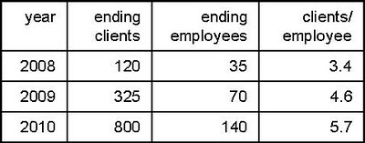
But the client/employee ratio can’t improve indefinitely. Many costs are not fixed: staffing for customer support, marketing, sales and administrative functions will all increase as clients are added. To get some idea of Marketo's variable costs, compare the change in employees with the change in clients. This is improving more slowly:
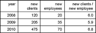
And here’s the problem: at 1 new employee for every 6.8 clients, Marketo is adding $200,000 in cost for just $163,000 in revenue (=6.8 x $24,000 / client). It truly does lose money on each new customer. You can’t grow your way out of that.
So what happens now? Let’s assume Marketo gets a bit more efficient and the new clients to new employee ratio eventually tops out at a relatively optimistic 8. At a cost of $200,000 per employee, those clients have to generate $25,000 in revenue for Marketo just to cover the increased expense. This is just a bit higher than the current $24,000 per client, so it seems pretty doable. But it leaves the existing $7.5 million annual loss in place forever.
In other words, Marketo must substantially increase revenue per client to become profitable. (In theory, Marketo could also cut costs. But the main controllable cost is sales and marketing, and incremental cost per sale is likely to rise as the company enters new markets and faces stiffer competition while pushing for continued growth. So higher revenue is the only real option.)
Revenue per client can be increased through higher prices, new products, and/or bigger clients. Pricing will be constrained by competition, although Marketo could probably discount a bit less. This leaves new products and bigger clients. Those are exactly the areas that Marketo is now pursuing through add-ons such as Revenue Cycle Analytics and Sales Insight, and enhancements for large companies in its Enterprise Edition. So, in my humble opinion, they're doing exactly the right things.
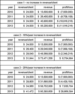
Some back-of-envelope calculations confirm that revenue per client is by far the most important variable in Marketo’s financial future. The following tables use some reasonable assumptions about growth in clients and clients per employee; take my word for it that the results don’t change much if you modify these. But results change hugely depending on what happens to revenue per client: losses continue indefinitely if it remains at the current $24,000 per year; they continue for two years and total $10 million if it increases at 10% per year; and they end after one year and $4.4 million if it grows at 20% per year. Bear in mind that revenue per customer did grow 20% from 2009 to 2010 ($20,000 to $24,000). So I’d expect it to continue rising sharply as Marketo firms up its pricing and starts acquiring larger clients.
Indeed, these figures raise the unexpected (to me) question of whether $25 million in funding is more than Marketo will need. I’d guess the company’s management and current investors were careful not to dilute their equity any more than necessary, so I think they’re planning some heavy investments that are not factored into my assumptions. In fact, the company has said as much: the VentureWire piece quotes Fernandez as stating the new funds will be used for additional sales and marketing staff, to open offices abroad, to integrate with other vendors and launch vertical services in sectors like health care and financial services.
I also expect continued aggressive pricing (perhaps more selectively than in the past) and maybe some acquisitions. It's possible that Marketo will also expand its own professional services staff, since clients definitely need help with adoption. But that would conflict with its existing channel partners so it would need to move carefully.
What does it all mean? Here are my conclusions:
- Marketo's losses reflect a conscious strategy to grow quickly through aggressive pricing. There is no fundamental problem with its cost structure: company could be profitable fairly quickly if it decided to slow down and raise prices.
- Marketo's future lies in the middle and upper tiers of the market. Its pressing financial need is to raise revenue per client, which will lead it away from the low-cost, bitterly competitive market serving very small businesses.
- The new funding will support an expanded marketing and product push. Competing with Marketo in its target segments is going to be a challenge indeed.
Here’s a bit more on this week's $25 million investment in Marketo: a piece in VentureWire quotes revenue for Markteo as $4.5 million for 2009 and "triple that" ($13.5 million) for 2010. This is the first time I've seen published revenue figures for the company. They allow for some interesting analysis.
Data I've collected over the years shows that Marketo had about 120 clients at the start of 2009, 325 at the start of 2010, and should end 2010 with about 800. Doing a bit of math, this yields average counts of 222 for 2009 and 562 for 2010, which in turn shows average revenue per client of $20,000 per year or $1,700 per month in 2009 and $24,000 or $2,000 per month in 2010. The table below throws in a reasonable guess for 2008 as well.
Given that Marketo’s list prices start at $2,000 per month for the smallest implementation of its full-featured edition, this is pretty firm evidence that the company has indeed been aggressively discounting its system – as competitors have long stated.
(Some competitors have also said that Marketo's reported client counts are cumulative new clients, without reductions for attrition. If so, the revenue per active client would actually be a bit higher than I've calculated here. But Marketo itself says the reported figures are indeed active clients and I've no basis to doubt them. The following analysis wouldn't change much either way.)
If you’ll accept a bit more speculation, we can even estimate the size of those discounts. That same VentureWire article quotes Marketo’s current headcount as 130 employees, compared with half that number at the start of the year. Assume there were 70 at the start of 2010 (which matches my own data) and will be 140 by year-end, for an average of 105. My records suggest that the headcount at the start of the 2009 was around 35, so the average headcount for that year was about 52.
Let’s assume a "normal" revenue of $200,000 per employee, which is about typical for software companies (and matches published figures for Marketo competitors Aprimo and Unica). That means Marketo revenues without discounting “should” have been about $10.4 million in 2009 and $21 million in 2010. Compared with actual revenues, this shows 2009 revenue was about 43% of the “normal” price ($4.5 million actual vs. $10.4 million expected) and 2010 revenue at about 64% ($13.5 million vs. $21 million).
So the good news for Marketo’s new investors is that Marketo has been discounting less (although there’s an alternative explanation that we’ll get to in a minute). The bad news is they have quite a way to go before they’re selling at full price.
We can use the same data to estimate Marketo’s burn rate. Costs are likely to be very close to the same $200,000 per employee (this includes everything, not just salary). My records suggest the company had about 25 average employees in 2008, for $5 million in expenses. Marketo was founded in late 2005, so let’s figure it averaged 10 employees during the previous two years, and that they cost only $150,000 because the early stage doesn’t involve marketing costs. This adds another $3 million. That gives a cumulative investment of $39.4 million.
We already know revenue for 2009 and 2010 will be about $18 million. The company started selling in late February 2008 and my records show it ended that year with 120 clients. Assume the equivalent of 50 annual clients at $15,000 and you get 2008 revenue of $750,000, for $18.75 million total. That leaves a gap of $20.65 million between life-to-date costs vs. revenues.
This nicely matches the “approximately $20 million” investment to date that Marketo CEO Phil Fernandez reportedin his own blog post on the new funding.
Now you can see why Marketo needed more money: its losses are actually growing despite having more customers and improved pricing. It lost nearly $16,000 for each new client last year ($7.5 million loss on 475 new clients). At that rate, even a modest increase in the number of new clients would have burned through nearly all of the company’s remaining $12 million within one year.
This isn’t just a matter of scale. It’s true that a start-up has to spread its fixed costs over a small number of clients, yielding a high cost per client during the early stages. Marketo shows this effect: the number of clients per employee has grown started at 3.4 at the end of 2008 and dropped to 5.7 at the end of 2010. This is the alternative to discounting as an explanation for those ratios of "normal" to actual revenue (remember: “normal” revenue based on number of employees).
But the client/employee ratio can’t improve indefinitely. Many costs are not fixed: staffing for customer support, marketing, sales and administrative functions will all increase as clients are added. To get some idea of Marketo's variable costs, compare the change in employees with the change in clients. This is improving more slowly:
And here’s the problem: at 1 new employee for every 6.8 clients, Marketo is adding $200,000 in cost for just $163,000 in revenue (=6.8 x $24,000 / client). It truly does lose money on each new customer. You can’t grow your way out of that.
So what happens now? Let’s assume Marketo gets a bit more efficient and the new clients to new employee ratio eventually tops out at a relatively optimistic 8. At a cost of $200,000 per employee, those clients have to generate $25,000 in revenue for Marketo just to cover the increased expense. This is just a bit higher than the current $24,000 per client, so it seems pretty doable. But it leaves the existing $7.5 million annual loss in place forever.
In other words, Marketo must substantially increase revenue per client to become profitable. (In theory, Marketo could also cut costs. But the main controllable cost is sales and marketing, and incremental cost per sale is likely to rise as the company enters new markets and faces stiffer competition while pushing for continued growth. So higher revenue is the only real option.)
Revenue per client can be increased through higher prices, new products, and/or bigger clients. Pricing will be constrained by competition, although Marketo could probably discount a bit less. This leaves new products and bigger clients. Those are exactly the areas that Marketo is now pursuing through add-ons such as Revenue Cycle Analytics and Sales Insight, and enhancements for large companies in its Enterprise Edition. So, in my humble opinion, they're doing exactly the right things.
Some back-of-envelope calculations confirm that revenue per client is by far the most important variable in Marketo’s financial future. The following tables use some reasonable assumptions about growth in clients and clients per employee; take my word for it that the results don’t change much if you modify these. But results change hugely depending on what happens to revenue per client: losses continue indefinitely if it remains at the current $24,000 per year; they continue for two years and total $10 million if it increases at 10% per year; and they end after one year and $4.4 million if it grows at 20% per year. Bear in mind that revenue per customer did grow 20% from 2009 to 2010 ($20,000 to $24,000). So I’d expect it to continue rising sharply as Marketo firms up its pricing and starts acquiring larger clients.
Indeed, these figures raise the unexpected (to me) question of whether $25 million in funding is more than Marketo will need. I’d guess the company’s management and current investors were careful not to dilute their equity any more than necessary, so I think they’re planning some heavy investments that are not factored into my assumptions. In fact, the company has said as much: the VentureWire piece quotes Fernandez as stating the new funds will be used for additional sales and marketing staff, to open offices abroad, to integrate with other vendors and launch vertical services in sectors like health care and financial services.
I also expect continued aggressive pricing (perhaps more selectively than in the past) and maybe some acquisitions. It's possible that Marketo will also expand its own professional services staff, since clients definitely need help with adoption. But that would conflict with its existing channel partners so it would need to move carefully.
What does it all mean? Here are my conclusions:
- Marketo's losses reflect a conscious strategy to grow quickly through aggressive pricing. There is no fundamental problem with its cost structure: company could be profitable fairly quickly if it decided to slow down and raise prices.
- Marketo's future lies in the middle and upper tiers of the market. Its pressing financial need is to raise revenue per client, which will lead it away from the low-cost, bitterly competitive market serving very small businesses.
- The new funding will support an expanded marketing and product push. Competing with Marketo in its target segments is going to be a challenge indeed.
Wednesday, November 17, 2010
LoopFuse Captures More Web Traffic Data
Summary: LoopFuse has extended its system to capture more Web traffic data, which lays the foundation for future analytics.
LoopFuse recently released its latest enhancements, which it somewhat grandiosely labels as making it “the First and Only Marketing Automation Solution with Inbound Marketing”. In fact, as the subhead to their press release states, what they’ve really done is somewhat more modest: add “real-time Web traffic intelligence” by providing features to capture search terms, referring sites and page views, and link these to individual visitors.
The new release also adds real-time social media monitoring (directly for Twitter and Facebook, and through Collecta for blogs, YouTube and other sources).
These features are certainly useful. But my idea of "inbound marketing" is more along the lines of HubSpot, which provides search engine optimization, paid search campaign management, social media monitoring and posting, blogging, and Web content management. Although LoopFuse might eventually add those functions, it hasn't yet and isn’t necessarily moving in that direction.
Accepting their labels for the moment, let’s look at what LoopFuse has added:
- “content marketing” is a set of reports that tracks Web traffic related to different assets. Users get a list of the assets ranked by number of page views. They can then drill into each item to see a graph of traffic over time and to see details such as the number of visitors, views per visitor, and referring domains and pages. Because the views are tied to individual visitors, users can also click on the referring domain to see what other pages people from that domain visited. This is essentially the same information as provided by...
- “inbound marketing”, which shows visitor sources by category (direct links, paid search ads, organic search) and details within each category (specific messages, ads or keywords). As just noted, users can drill down to see which Web pages were viewed by visitors from each source.
- “social monitoring” provides real-time monitoring of user-selected terms on the various social Web sites. Unlike the other Web traffic data, this information isn’t stored within the LoopFuse database and isn't tied to specific individuals. LoopFuse plans to provide some trending reports in the future. Of course, the real trick would be linking social media comments to lead profiles.
All of these are valuable reports. Having them within a single system is particularly helpful for the small businesses targeted by LoopFuse, where all channels are likely to be handled by a small department and possibly the same individual. Otherwise, the users would need switch among several systems to do their job. In larger firms, where different people would be responsible for different channels, each channel can be managed by a separate system without requiring anyone to use multiple products.
Saving effort is nice, but the real value of a unified marketing database is being able to coordinate marketing messages and relate all marketing contacts to sales results. LoopFuse hasn’t publicly revealed its approach to marketing performance measurement but definitely has something in the works. I’m particularly hoping they'll use the detailed behavior information to relate outcomes to specific marketing messages, rather than just looking at movement through purchase stages. Although stage data by itself can project future revenues, it must be tied to specific marketing programs to measure those programs’ value.
In case you’re wondering, LoopFuse is storing the new Web traffic data in denormalized tables that are separate from the operational marketing database. This enables much quicker response to ad hoc queries and, should eventually support the time-based views needed for trends and stage analytics.
For those of you keeping score at home, LoopFuse’s Roy Russo also told me that the company stores each client’s data in a separate database instance. Russo said this has proven more scalable and cheaper than the textbook Software-as-a-Service approach of commingling several clients’ data in a single instance. So far as I know, most (but not all) marketing automation vendors use same approach as LoopFuse.
Russo also said that all data in the system is accessible via standard API calls, something that’s also not always possible with competitive products. In fact, Russo said LoopFuse’s entire interface is built on using the published API, which means that technically competent clients could build alternative interfaces to embed LoopFuse data and functions within other systems. If nothing else, this gets them Geek Style Points.
Of course, no discussion of LoopFuse is complete without mentioning its freemium offer, launched last June amid considerable controversy. The company says that nearly 1,000 accounts have now signed up for this, which is impressive by any standard. No news yet on how many have converted to paid.
One side effect that I hadn't anticipated – although LoopFuse apparently did – is that agencies and consultants use the freemium to service new clients, who convert to paid when their volumes grow. This gives LoopFuse an edge in the competition for channel partners. The value of that edge is a bit uncertain, though, since an increasing number of service firms – including Pedowitz Group, Annuitas and LeftBrain Marketing – are now working with multiple marketing automation vendors.
Why Put Another $25 Million Into Marketo?
So...our friends at Marketo announced today that they've received another $25 million in venture funding. As one of their competitors snippily commented on Twitter, "Does that make the total $50M or $60M? I lost track."
I've lost track too, but it doesn't really matter. Marketo's strategy has been clear from the start: spend heavily to establish a strong position despite a relatively late start in the market. Of course, it wasn't just a matter of spending (Microsoft Zune, anyone?); they needed a solid product and good marketing as well. On all fronts, Mission Accomplished.
But the question is, what happens now? Obviously Marketo has a plan in mind and has convinced some pretty savvy investors that it makes sense. Presumably they've demonstrated a highly scalable business model that will allow them to take the latest funding and reliably transform it into growth and, eventually, into profits.
I find it a bit surprising that anyone can be $25-million-worth-of-certain about anything in such a young and volatile market, particularly because I still think B2B marketing automation will eventually be absorbed by larger CRM and/or Web content management suites. Certainly Marketo could be acquired by one of those companies but I don't think the price would be high enough to make the VCs happy. And surely they're still some time away from an IPO given what must be seriously money-losing financials to date.
I'm mostly writing this post in the hopes of seeing some helpful comments from others in the industry. Where does this all lead, both for Marketo and its competitors?
Tuesday, November 16, 2010
Eloqua10 Offers a Much-Improved Interface and Revenue Reporting
Summary: Eloqua10 provides much-needed update to Eloqua's user interface and a new reporting infrastructure for “revenue performance management”. Neither change is revolutionary but both substantially improve the company’s competitive position within the crowded B2B marketing automation industry.
Eloqua is slated to officially release its long-promised Eloqua10 system on November 21. The main changes are an updated user interface and a new foundation for what the company calls "revenue performance management".
Let’s start with the interface. Previous versions of Eloqua were very powerful but notoriously difficult to learn and use. The company took this criticism to heart and began work more than two years ago on a new approach. The primary goal was to speed and simplify user navigation, which its research found was the root cause of 70% of user problems.
The new interface is a huge improvement. Users start on a customizable home page, which they populate from a pool of widgets for recently accessed items, favorite reports, upcoming campaigns and other information. System functions are access through tabs that align with typical user roles: campaigns for program designers, assets for content creators, contacts for segmentation managers, insight for managers and analysts, and setup for administrators.
Campaign design has been wholly revamped. The old system used a classic Visio-style diagram that only an engineer could love. Users now drag campaign components into a blank canvas, and then connect and configure them. The esthetics are carefully thought out, with components grouped and color-coded by type:
- audience (segment members)
- assets (email, e-form, landing page)
- decisions (a mix of lead behaviors [clicked email, opened email, submitted form, visited Web site] and attributes [compare contact fields, shared list member, sent email])
- actions (add to campaign, add to program, move to campaign, move to program, wait)
The components are connected with squiggly lines, which probably makes no actual difference but definitely seems more friendly.
More substantively, multiple users can work on the same design simultaneously and the designs can be saved as reusable templates. It’s worth noting that the “move to campaign” action can send leads to a specific step within another campaign – not a new feature but still rare within the industry.
Users can open up assets within the campaign flow and then create or edit them. Eloqua10 introduces a Powerpoint-style design interface that lets users drag objects into place and see the changes rendered immediately. These Powerpoint-style interfaces are increasingly common among marketing automation systems, replacing the older approach of editing blocks within predefined templates. The objects can be text, images, data fields, hyperlinks or dynamic content blocks.
Eloqua10 uses the new interface to create emails, forms and landing pages – an improvement over the older version, which had different design tools for different asset types. One downside of the change is that some assets built in previous Eloqua editions will need to be modified, as will some reports.
However, old campaigns and data should transfer to the new format automatically. This reflects the fact that, once you get beneath the interface, the functionality and data structures are largely unchanged from Eloqua9.
The big exception on the data front is what Eloqua calls “revenue performance management” (RPM), which uses a new analytical database that tracks the movement of leads through stages within the buying process. This database is updated in near-real-time with operational transactions and can also receive opportunity outcomes from sales automation or other external systems.
Unfortunately, Eloqua hasn’t released the actual reports that will be provided for RPM. It does say there’s a list of sixteen, of which some already exist. Reports they’ve mentioned include: the number and ages of leads at each stage in the funnel; relation of leads delivered to sales capacity at local levels; and revenue projections based on existing leads and stage-to-stage conversion rates. I don’t know which of these are already available.
There’s also a “two way revenue attribution” report that shows revenue allocated both by “first touch” and “all touch” methods. Although I’ve previously made clear my objections to revenue attribution in general, I think this approach is relatively sensible. “First touch” reporting is useful for acquisition programs, while “all touch” shows which programs are reaching buyers even if it doesn’t show the programs’ actual influence. With apologies for damning with faint praise, I’ll say Eloqua's approach is better than the illusion of precision created by fractional attribution.
Other enhancements planned for future releases include:
- benchmark reports that let marketers compare their company’s performance with averages for similar firms
- enterprise-level security enhancements such as global log-in across multiple Eloqua instances and item-level asset security
- user interface versions in languages other than English
- a new lead scoring interface and analytics to help build more accurate scoring rules
- Webinar management
- fax, SMS and print-on-demand outputs
Eloqua has a dozen or two customers already running Eloqua10. Other clients will be converted to the system over time to ensure users are ready for the new interface and have converted whatever assets and reports are needed. The company has a suite of new training materials in place and will not charge extra for the conversion.
Subscribe to:
Posts (Atom)